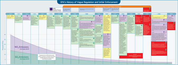
Although trial consultants prepare dozens of different types of exhibits that help judges and jurors understand a case, timelines are one of the oldest and most reliable. After all, most cases involve some sort of time sequence, and the order and timing of events can be crucial. Timelines give jurors an intuitive understanding of a case – if they are done well.
While it seems simple to prepare a timeline, it is actually an art that requires practice and experience, just as any form of trial presentation would be. The following suggestions have worked well for our firm in over 10,000 cases since 1995:
- Engage Your Audience: The timeline is meant for the jurors or the judge to understand. It’s a device that makes the case clearer to them. The timeline is not something that is intended to jog your memory. You should know your case perfectly or nearly perfectly without the timeline. In fact, in order to keep your audience engaged, you should feel free to add devices like photos, videos, charts, and the like. The more your timeline tells a story without explanation, the better it is.
- It’s Not About the Bar: In general, the timeline should focus on the relative position of the events in the story that it tells, not on the date bar. If you are going to highlight a portion of the timeline, highlight the events themselves, and don't make the date bar the focal point. When was the device invented? When was it marketed? When did a competing device enter the market? Those can be key facts in a patent case, and they should be the focus of the timeline. If anything in the timeline should be highlighted with color or other design elements, it should be these events.
- The Key Is Not the Key: Although a lot of people think a timeline needs a complicated legend or key, the truth is that it should be fairly self-explanatory. Rather than a legend, use logos, icons, company symbols, or other design elements to explain what the timeline represents.
- Keep It Short: Jurors’ attention won’t remain on a timeline that is too long and complicated. Revise and redraft your timeline so that it focuses on the most important events, not on all events that are conceivably relevant.
- Keep It Large: Don’t make the timeline too small. Otherwise, jurors will lose interest. We think the timeline should use no smaller than 20-point type.
If you follow these tips, we think you can create a very effective timeline. If you have additional tips or comments, please use the comments box below.
Here are several other A2L Consulting resources on timelines and litigation graphics:


Leave a Comment