by Ken Lopez
Founder & CEO
A2L Consulting
Like creating a new logo or a new ad campaign or hiring a speech writer - or perhaps the best comparison of all, like a trial attorney preparing for trial - we normally find that a lot of work goes into creating draft litigation graphics that are not ultimately used at trial, in a hearing or for some other originally intended purpose.
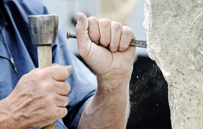
Michelangelo, sculptor, artist and architect, said, "Every block of stone has a statue inside it and it is the task of the sculptor to discover it."
Creating litigation graphics is a lot like that. When we come into a case, more often than not the trial team has not considered how to present the case, and we are just months or weeks from trial. Our job is to quickly understand the case, assess the trial team's style, whether creative or plain, whether wordy or more modern, whether multimedia or single-channel, and then begin generating litigation graphics, sometimes hundreds of them, in short order.
What may seem like chaos is actually a well-rehearsed act of creativity. Like Michelangelo's block of stone, we begin to visualize the finished piece by chipping away the unnecessary portions of stone. In practical terms, that means running a lot of litigation graphics by the trial team and then paring down. So, in a sense, we have to both build the stone and sculpt it. From chaos comes order.
Just as a branding firm will usually give you three to nine designs to pick from, or as a speech is refined over time, or as a trial team will abandon themes, arguments, or claims at trial, when creating litigation graphics the final product is properly a product of a whittling down process. Thus it is in a trial team's best interest and the client's best interest to accept a large number of litigation graphics early on that won't be used in the final product.
You see, without a set of boundaries or a map to navigate by, the trial team has to work harder under increasingly stressful conditions to express their desires clearly to the litigation graphics consultants. Thus, it is best to be frugal closer to trial rather than earlier in the development of litigation graphic designs. Otherwise, one is being penny-wise and pound-foolish.
Here are 10 reasons that those bits of creative stone you chipped away when creating litigation graphics were more important than the finished product.
- You may not know what you like until you know what you don't like. Whether you are picking out new furniture, a new car or deciding on the right approach for litigation graphics, it is normally easier to rule things out than conjure the perfect end result.
- You know it when you see it. Many people have a good artistic eye but lack the experience and training to execute the vision. This is typical and a good quality among most litigators.
- Choosing from a menu of options is easier than designing from scratch. You don't often go to a restaurant and say I'd like you to combine these 10 ingredients into something I like. The same is true of litigation graphics. You order from a menu, because it is easier for you.
- Choosing from a menu of options is faster than designing or describing in precise detail what your end product should look like (and your hourly rate is higher than ours).
- It’s easier to pick and choose elements. If you have ever been involved in a logo design project or redecorated a house, you'll surely have experienced this phenomenon. You'll often like one thing from here and another from there. It's normal.
- You can avoid the problem of “a horse designed by committee.” (It results in a camel, in case you were wondering.) A graphic in draft form has some amount of stickiness; it is less likely to be radically changed than an idea in someone's head.
- This process helps the litigation graphics firm match your style earlier, not later. Different trial teams have wildly different approaches. One of the best ways to assess a team's approach is to put work in front of them and assess their reaction. This is why we insist that the first review of any first draft presentations is done in person or by video call. Our litigation graphics consultants must work from the team's reactions.
- You find an opportunity to assess admissibility. Sometimes a graphic that someone on the team wanted to create is just not going to be admitted, but it needs to be created anyway - just to get ruled out. At the insistence of counsel, we've put devil horns on alleged thieves, we've made people look like they had a mug shot, and we've illustrated the opposing party's image to look like a robber baron. We know they won't be used and won't be admitted, but it was an exercise that had to be seen through.
- Time to reflect produces better results. Whether it be a new way of looking at analogy or a way we open the door to evidence we don't want in - putting more exhibits out there helps us deliver a high level of creativity.
- Most importantly, without having gone through the process of many drafts becoming one final graphic, you would not have arrived at what is your David or Sistine Chapel - whether that be your opening presentation, your Markman hearing, your patent tutorial, your ITC hearing or your arbitration, without all the efforts to get there.


Leave a Comment