by Ken Lopez
The term information design is less than fifty years old. The use of specialty trial graphics in the courtroom started less than thirty years ago. Only very recently have the terms been used in the same sentence. That is, only recently have individual practitioners of both arts emerged.
Wikipedia describes information design as "the skill and practice of preparing information so people can use it with efficiency and effectiveness. Where the data is complex or unstructured, a visual representation can express its meaning more clearly to the viewer." I would call it simply the effective and efficient presentation of information. Applied to the litigation graphics consulting industry of which I am a member, I would add the word persuasive. This is true since the job of the modern litigation graphics consultant is to persuade not merely to present information.
Effective information design is not new as evidenced by Charles Minard's 1869 chart below. It plots the size of Napoleon's 1812 army (width of the beige and black areas), the distance traveled, the time elapsed and temperature on the bottom. In a nutshell, it tells the ill fated story of the near complete elimination of Napoleon's 400,000 man army due to battle deaths but mostly deaths from sub-freezing weather conditions. On the original, each millimeter eerily and with clever mathematical alignment represents the deaths of one thousand men. Looking at the chart, it's no wonder Tchaikovsky penned the 1812 Overture to celebrate the Russian victory defending Moscow.
[courtesy Wikipedia Commons]
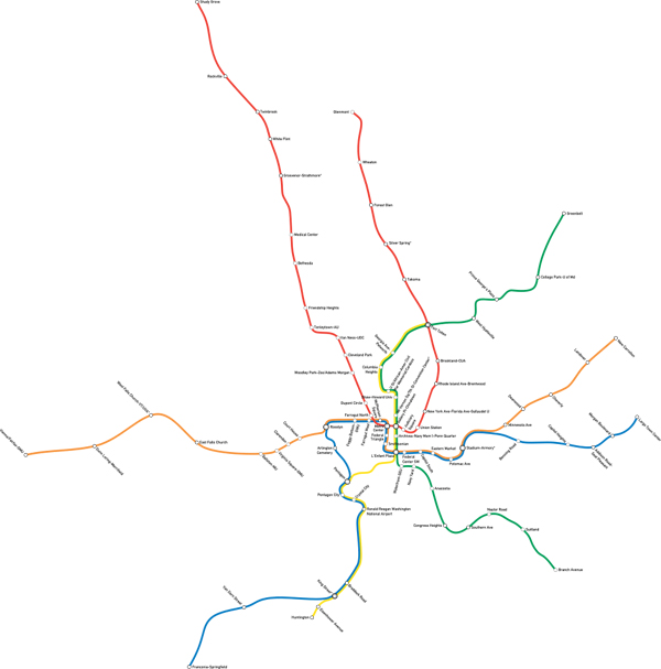
Of course, effective information design is around us every day. Mostly, it goes unnoticed except by those of us who study it, and that is exactly the point. When we instantly know which bathroom door to walk into, what dangers lie ahead in the road, which button to press on the latest Apple product or which subway line will get us to where we are trying to go, we are likely experiencing effective information design. The map of the Washington DC Metro is one of my favorites. A comparison of the current map and a map drawn to scale is below. It is pretty clear which works best, and it strikes me as funny that the scale version looks a lot like the style of NYC's map which recently underwent a redesign.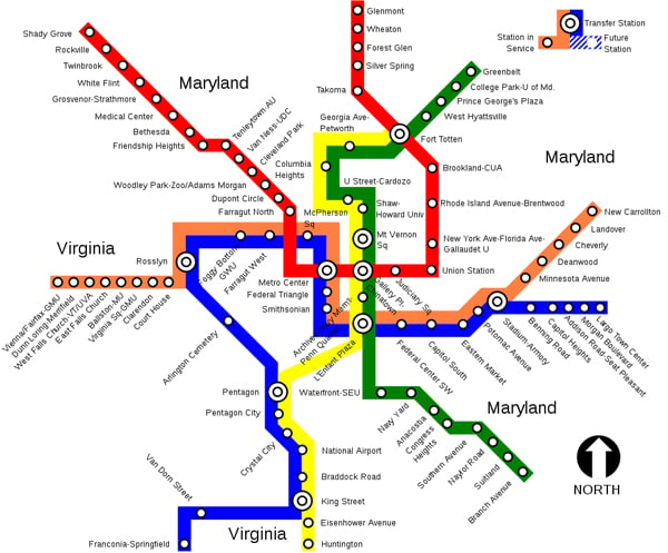
[courtesy Wikipedia Commons]
[courtesy Wikipedia Commons]
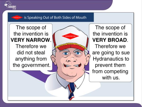
In the courtroom, incorporating information design with trial graphics requires the talents of a highly skilled practitioner. This is true since the viewer (judge and/or jury) will not usually have much time to consider or quietly reflect on the graphic. The courtroom viewing experience is an altogether different one than studying a printed subway map or reviewing the latest New York Times information graphic. Instead, the courtroom information design or trial exhibit is something that must be quickly digested and designed with maximum persuasive impact. I like to think of litigation graphics as telling a one sentence story as opposed to Charles Minard's paragraph-long story about Napoleon.
For example, you might want to say a firm or person is speaking from both sides of their mouth:
Or you might want to say someone is playing a shell game with company ownership: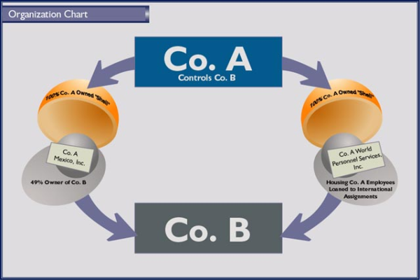
or you want a jury to remember a key term like video tagging in patent litigation: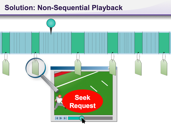
or you might want to summarize how the standard of care requiring a single diagnosis for multiple medical symptoms was not met: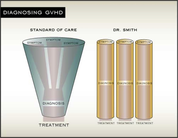
It is pleasing for me that the worlds of information design and trial exhibit design have merged in a handful of trial graphics consultancies. These firms are putting out amazing graphics on a daily basis that persuade when millions or billions of dollars are at stake. I am honored to be a part of this industry and proud of my firm's achievements in advancing its growth and acceptance.
CONTACT US for a free consultation and/or conflicts check.


Leave a Comment