Have you ever seen the President of the United States give a PowerPoint presentation? Probably not. But he's actually quite good at it, as you will see below.
For at least the past two years, President Obama's team has created PowerPoint-style presentation graphics that support his speeches and policies. The work they are doing is excellent and is relevant to trial attorneys and lobbyists alike.
Below is a White House-created "enhanced" version of the 2012 State of the Union address. It was broadcast at the same time as the State of the Union address but only on the Web (an asset in wooing younger voters, who increasingly use only the Internet for news and media). It places the live feed of the president's speech next to a series of trial-like presentation slides.
In many ways, a State of the Union address is similar to an opening or closing statement. Accordingly, for the trial attorney, there are many lessons to take from this speech/presentation combination. These include:
- Watch how the President uses emotion-evoking photographs to tell a story. In a mock trial setting, photographs are normally received very well by the jurors, but many litigators erroneously leave them out of their opening statements.
- Look at the obvious high quality style of the President's presentation. The fonts used are not standard Arial or Times New Roman; colors are well chosen; and the presentation seems worthy of the office of president. Such style in presentation is not reserved for the Commander-in-Chief but is available to anyone who wants it.
- Notice that each slide is simple enough to understand in a moment or two. A common trial mistake is to try to put too much into a single slide. I urge you to adhere to the philosophy that one slide = one sentence of meaning (with no conjunctions).
- Notice also that the President is using an immersive (i.e. continuous) graphical presentation. A recent study showed this to be the most effective form of presentation (particularly for persuasion), and I encourage you to adopt this technique.
- Note that the President used roughly 91 slides for a 65-minute speech or about one slide every 42 seconds. That's consistent with the latest research, but part of the reason the President's presentation was so successful is that he did not need to specifically speak to any of the slides. The graphics spoke for themselves, which is how such graphics should be designed.
- Finally, there are no bullet points! Good graphics don't have them.
The 2011 enhanced State of the Union slides below are similar to those from 2012 above. However, the differences between the slide decks are interesting. The 2012 speech slides are more refined in style. There are fewer photos, and there were 23 more slides used in about the same time.
The White House has continued its push for information graphics beyond the State of the Union as well. Perhaps more so than the State of the Union, the White House's use of widely distributed information graphics (or infographics) for issue advocacy points the way for lobbying efforts generally. The administration often uses captivating postcard-style information graphics that speak to a single issue. These are often widely distributed on social networks.
The Obama-Biden campaign's most successful use of an infographic was the one that recently made the rounds about job growth.

This image above has been shared millions of times on Facebook and Twitter. It is similar to a timeline that A2L might use in a trial format, and it is similar to the work we do in issue advocacy outside the courtroom. It has been well designed to be shared easily, and I have seen it countless times on my friends’ Facebook pages.
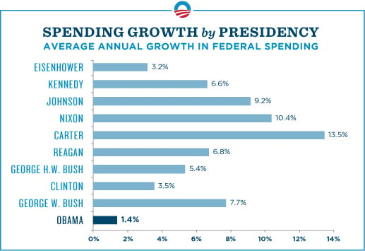
The presentation graphic below was released just this week. It does a fine job of responding to criticisms of the administration's spending. However, if a presidential contest were litigation, this chart would not likely survive an objection. See if you can spot the issue.
The 1.4 percent figure is absolutely correct - but only if you use 2009 as the year to compare with 2010, 2011 and 2012. It's a smart technique to use when advocating. In fact, spending in 2009 rose by about 18 percent relative to 2008. Raw data sourced from the non-partisan Congressional Budget Office (.PDF) is below.
Total Federal Outlays in Trillions of Dollars
2007 - 2.729
2008 - 2.983
2009 - 3.518
2010 - 3.456
2011 - 3.598
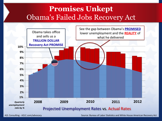
I have friends in all parts of the political spectrum, but I have yet to see a Romney campaign infographic on Facebook. As the campaign goes on, this may, of course, change. Perhaps the Romney campaign should consider using an infographic similar to that below. This graphic effectively hits back at the Obama-Biden jobs infographic while calling into question the credibility of future campaign promises.

Sharable infographics are the new sound bites. Advocates distribute them to their followers who then share the graphic with millions of people within a few days. Followers use these tools in online conversations similar to the way one might say flip-flopper, draft-dodger, war hero, patriot, or socialist in face-to-face conversations. They are a form of shorthand that can be quickly digested.
As is often the case in the courtroom or in issue advocacy, the best presentation graphics distributed in the most effective ways will likely help one side prevail in this presidential contest.
Please use the social media sharing buttons at the beginning of this article to like or share, and please consider leaving a comment below (your email is not shared).


Leave a Comment