by Ryan H. Flax, Esq.
(Former) Managing Director, Litigation Consulting
A2L Consulting
As a litigation consultant, one of my primary responsibilities is to help litigation teams develop and effectively use demonstrative evidence to support their trial presentation. The primary means of doing this is to create litigation graphics, which are most commonly used as PowerPoint slides that accompany oral argument and witness testimony.
A lot of what goes into creating effective litigation graphics relies on the evidence to be presented. If the evidence relies on a document and, specifically, on a particular part of that document, a document callout is standard fare. If damages are the issue, it’s not uncommon to use a chart or table to illustrate to the jury how they should add up the money to arrive at the desired result. However, a lot more goes into designing and developing really effective litigation graphics than the clever manipulation of evidence. Did you know that color plays a major role?
Litigation graphics are almost never black and white – they almost always involve the use of color. Most colors carry psychological (and even physiological), cultural, personal, emotional, and expressive implications that can impact how persuasive you are when using them. Here’s an example:
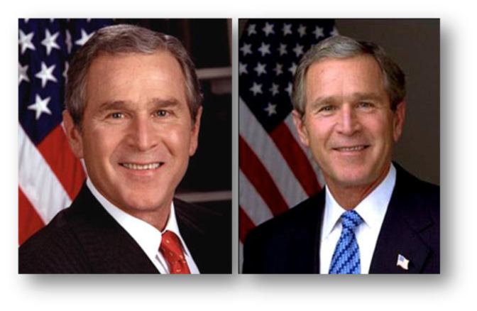 Looking at the two photos of President Bush above, minus any personal political views you may have, which president is more trustworthy looking? I bet you said the one on the right. Do you know why?
In modern, holistic medicine, chromotherapy is used to heal with color. This form of treatment dates back millennia to ancient Egypt, China, and India. A more prominent use of color therapy occurs in environmental design, which considers the effect of color on health and behavior and develops interior design, architecture, and landscape design accordingly. An interesting example is use of the color Baker-Miller Pink (R:255, G:145, B:175), affectionately known as “drunk tank pink” because it is commonly used in jails to keep violent prisoners calm.
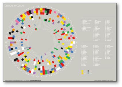 Human responses to color are not just biological, but are also influenced by our culture (in China the color yellow symbolizes royalty, but in Europe it’s purple that plays this role). David McCandless created this amazing color wheel (right) to illustrate how different cultures interpret colors (or “colours,” as Mr. McCandless is an author and designer from the U.K.). People (and by people, I mean jurors and judges) also respond to colors in individual ways. Although research reveals variables that help explain human responses to color, it is also true that is our own color preferences are important to us and partially dictate the effect color has on us.
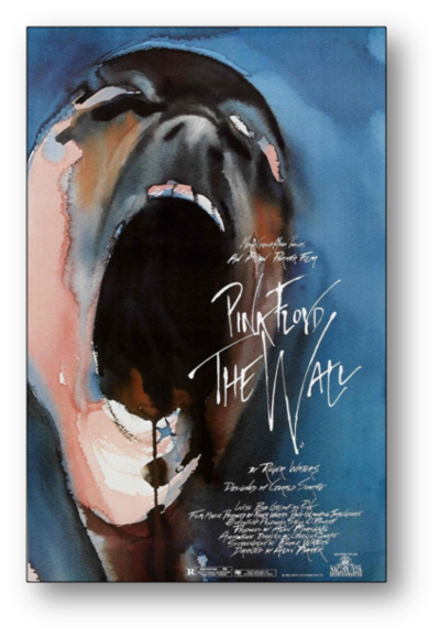 Color also causes emotional effects, which depend partly on the color’s surroundings and partly on the ideas expressed by the work as a whole. There are two opposing ways to use color in graphics (as in art): local and expressive color. At one extreme is local color, which is the color that something appears when viewed under average lighting conditions, e.g., a banana is yellow. At the other extreme is expressionistic color, where artists use color to express an emotional rather than a visual truth. Just look at the famous art from Pink Floyd’s The Wall here – the use of dark blue, gray and black in the background convey an intense feeling of sadness and depression, while the blacks and reds of the figure convey danger and anguish. Both of these color concepts effect a viewer’s emotions. The expressionistic use of color is very important in the field of litigation graphics.
Why?
Jurors (and judges to an extent, as human beings) make decisions at trial based on their emotions above all else (download and read this paper on the subject by Todd E. Pettys, Associate Dean at the University of Iowa College of Law). Concepts like confirmation bias and research on decision making support this. Two thousand years ago, Aristotle observed that the most persuasive arguments are those that appeal, at least in part, to the audience’s emotions (Aristotle, On Rhetoric: A Theory of Civic Discourse 112-13 (George A. Kennedy trans. Oxford Univ. Press 2d ed. 2007).
Traditional artists have used color to evoke emotion in specific ways:
Red – heat, passion, danger, optimism
Yellow – warmth, caution, fear, cowardice
Blue – responsibility, trustworthiness, compassion, honesty, integrity, morality, coolness, quality
Orange – confidence, creativity, fun, socialness
Green – natural, healthy, harmony, cheer, friendliness, immaturity
Purple – regality, intelligence, wealth, sophistication, rank, shock
Gray – neutrality, ambiguity, dullness, somberness
Black – evil, unknown, treachery, depression, undesirability, danger, falsity
White – innocence, purity, fairness, conservatism, harmlessness, transparency
Pink – femininity, sweetness, liberalism
Brown – natural, solid, sadness
These same principles are applied today in information graphics and the graphic arts. For example, according to Mr. McCandless’s color wheel (above and at link), the color black represents and connotes authority, the color blue intelligence and rationality, and purple virtue – interestingly, he indicates no culturally based color in Western culture for wisdom or trust.
Did you ever notice how many law firm logos are blue? Why do you think that’s the case?
Here’s an exemplary litigation graphic that might be used by an expert witness using the above-discussed color principles to evoke a sense that the expert is honest, unbiased, and intelligent:
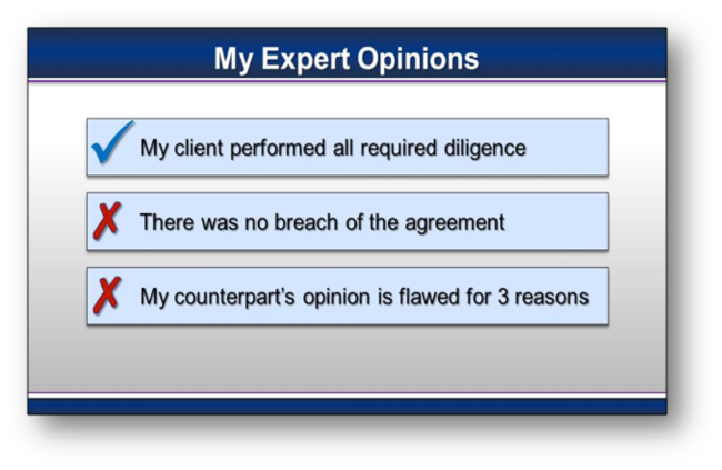 It may look simple, but a lot of thought went into its design. The overall color palate of blue, purple, and gray is intended to evoke trust and neutrality. Furthermore, the light blue color used in the text boxes is intended to again express that they are relaying true information. The accompanying icons (the check and x-marks) are similarly colored so as to relay that the top statement of opinion is trustworthy (blue) and that the second two are warnings (red) for jurors that they should not believe what they heard from the opposition’s expert witness.
If you want to be more persuasive at your next trial or hearing, let us worry about these details to help you be your best.
Here are some other articles related to litigation graphics that you may find helpful:
- 8 Videos about persuasion that will help in the courtroom
- Using the right font can change people's minds - sort of
- 6 trial presentation mistakes you should avoid
- 6 studies that can help you understand why litigation graphics are so important
- Free Download: See A2L Consulting's Top 10 Litigation E-Books




Leave a Comment