by Ken Lopez
Founder/CEO
A2L Consulting
Have you ever heard any of the following during a PowerPoint presentation?
- "It may be hard to make out the details of this slide."
- "I'm not sure if you can read this in the back of the room."
- "In case you can't read this, let me read it for you."
- "I know there is a lot on this slide, but bear with me."
- "Let me try to zoom in on this part of the slide [proceeds to fumble with remote]"
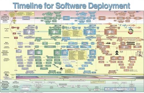
Of course you have heard these apologetic statements. If you are in the business world, you have probably heard them all. However, there is never an excuse to say these things whether in a boardroom or in a courtroom. As much as you may want everything you have to say about a key message on a single PowerPoint slide, as hard as it may be to imagine another way of doing things, I promise, you most definitely do not need everything (or even a lot) on one slide. And, you can still get your point across.
The number one video in my recent article The Top 14 TED Talks for Lawyers and Litigators 2014 as well as other articles I have written like 12 Reasons Bullet Points Are Bad and 7 Ways to Avoid Making Your PowerPoint Slides Your Handout describe methods for limiting the amount you put on your slide.
The number one video in my recent article The Top 14 TED Talks for Lawyers and Litigators 2014 as well as other articles I have written like 12 Reasons Bullet Points Are Bad and 7 Ways to Avoid Making Your PowerPoint Slides Your Handout describe methods for limiting the amount you put on your slide.
With all this said, it is important to remember that sometimes you just need everything on a slide. Sometimes it is an advantage. So, in this article, I want to offer twelve easy methods for eliminating PowerPoint slide clutter and focusing your audeince's attention on what matters - you and your message. Sometimes, albeit rarely, this means getting everything onto a single slide. More often than not, however, it means taking a single slide's complicated content and spreading it across many slides without your audience knowing you've even changed slides.
- 28 point font: My recommendation is to use no less than 28 point text, and if you do so, you will be forced to take care of most slide-clutter issues before they become problems. Most of the points below will explain how one might do this.
- One idea per slide: Another technique for eliminating slide-clutter, and a best practice generally, is to only include one idea, one takeaway, and one message per slide. Try not to focus on your total slide count as this is mostly irrelevant to the length of a presentation. Focus instead on one idea per slide or one idea per click on your remote.
- Zoom with remote: Some projectors have a nice high quality zoom feature that allows you focus in on one area of a slide. IF you are very adept with this feature, IF you are in control of the projector and the technology in the room and IF you have a high-enough-resolution image, then this may be a good option, but I don't recommend it for 99% of all presenters. The resolution of your image must be high enough so that it does not pixelate when you zoom.
- Zoom box: Say you want to present something like an organizational chart with 25 elements on it. You might show the whole thing to start with, but no one can be expected to read it since the font size will be far too small. Consider starting with the whole image and then placing a zoomed-in version of portions of the chart on subsequent slides. To keep your audience oriented, use a small icon of the full image in the corner with a red box to indicate the portion you are showing.
- Sliding timelines: Very often people want to put a timeline onto a PowerPoint slide. If it has more than five items on it, it gets hard to read. One technique that we use, described in example 25 in A2L's free book, The Litigation Guide to Trial Timelines, is to create a sliding transition between time spans in the timeline. If you break your timeline up onto multiple slides it is easier to read. If you use the sliding transition, you give the impression of a larger timeline and keep your audience oriented.
- Prezi: Prezi is an alternative presentation tool to PowerPoint. It allows the presenter to create a large canvas of materials (i.e. videos, text and images) and allows the presenter to zoom into portions of the canvas. I think it is a neat program, we use it at A2L, but in the hands of an untrained user, Prezi presentations give people motion sickness. You can learn more about it and see an example in my article Collateralized Debt Obligations (CDOs) Explained for a Jury.
- Custom animation: Zoom effects in PowerPoint are not for beginners. PowerPoint actually makes it quite hard to zoom in on an element in a slide without it becoming pixelated. However, if you have learned how to do this, you can take something like an org chart and create animated zooms into key elements of it to make your points. Done well, the audience never loses sight of the big picture.
- Layer elements in: When it is advantageous to show many elements together on a slide, the best way to do this is to build them in over time. Showing an audience too much at once causes them to shut down. Allowing comfort with the materials to build over time is a best practice. Example #4 in The Litigation Guide to Trial Timelines illustrates this nicely.
- Zoomed-pop-in elements: Similarly, if you need to show many things on a single image, you can make them legible by introducing one element at time, zoomed in, nearly full screen. Once introduced they can reduce in size and be placed where important. For example, in an org charge, each box could start full-screen sized and then shrink while moving into place on the chart.
- Hyperlinked elements: When you are not sure what order you have to show materials in, you can use PowerPoint's hyperlinking function to pop-up an object so that it is legible. For example, if you are showing an org chart, you could create a hotspot on each position that when clicked would zoom open a larger version of the box. Example #7 in How To Use and Design Trial Timelines shows how this is achieved.
- Printed materials: Very often, it just makes no sense to show something in PowerPoint. Printed documents have better resolution than a screen and offer a range of other advantages when handed out. See also 7 Ways to Avoid Making Your PowerPoint Slides Your Handout.
- Exception: Sometimes you want to show how hopelessly confusing something is to gain an advantage. This is the only exception to the rules articulated above. For example, if you want to show that a process was nearly impossible to follow, PowerPoint may be ideal since you can build elements of the process over time until it becomes impossible to follow.
In subsequent posts, I am going to take these topics and show how to handle each of them. In the meantime, here are some articles and resources that discuss eliminating slide clutter, best practices for using PowerPoint and how to present well in general:
- Using PowerPoint in Litigation Webinar
- 7 Ways to Avoid Making Your PowerPoint Slides Your Handout
- The Top 14 TED Talks for Lawyers and Litigators 2014
- 16 PowerPoint Litigation Graphics You Won't Believe Are PowerPoint
- 12 Ways to SUCCESSFULLY Combine Oral and Visual Presentations
- Trial Graphics Dilemma: Why Can't I Make My Own Slides? (Says Lawyer)
- How To Use and Design Trial Timelines
- Using & Creating Litigation Graphics to Persuade
- How To Create Persuasive Visual Presentations
- A How-to Guidebook for Designing Great Presentations, Making Great Speeches and Connecting with Your Audience


Leave a Comment