by Ryan H. Flax, Esq.
(Former) Managing Director, Litigation Consulting
A2L Consulting
It is well known and generally accepted by the top performers in the litigation community that you need to use demonstrative evidence, including litigation graphics, to be persuasive at trial. As a scientific certainty, using visual support to back up your key points and arguments is critical to maximizing persuasiveness. As a litigator, I’ve personally created and used graphics, and developed litigation graphics for others, to use at trial, at Markman (patent claim construction) hearings, and for other presentations. As a litigation consultant, I’ve seen countless terrific litigators both understand that they do need graphics and at the same time misunderstand how they should be using litigation graphics in these and similar settings.
My new friend, Alan Fisch of the DC-based, IP litigation powerhouse Fisch Sigler LLP, and I were just discussing this over lunch and agreed that it’s remarkable how true this is and how many great litigators lose at trial because they fail to master the basic principles of trial persuasion. Using trial graphics incorrectly can be as bad as or worse than not using them at all.
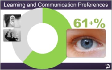 Before getting into the “how,” the question of “why” visual support is so critical to trial success must be touched-upon. Studies show that the majority of people are visual-preference learners, or at least combination visual and some-other-learning-style-learners. See, e.g., Felder and Spurlin, Applications, Reliability and Validity of the Index of Learning Styles, Int. J. Engng. Ed. Vol. 21, No. 1 at 103-112 (2005); Ayse Esmeray Yogun, Match or Mismatch Between Business Students’ and Business Academicians’ Learning Styles: A Research at Toros University, The Macrotheme Rev. 3(2), 38-46 (Spring 2014); see also, Animators at Law Communication Style Study. This means that people want to be taught and will better understand lawyer argument and witness testimony if it is not only spoken to them, but also shown to them visually. The theory is that by presenting information and argument to jurors (and judges) in the way they likely prefer to receive it, they’ll enjoy and pay more attention to your presentation and remember what you say.
 There is actual scientific research to back this up, specifically in the litigation setting. A wonderful man named Dr. Jai Park and his research partner, attorney Neal Feigenson, studied the effects of using visual support (in the form of PowerPoint graphics) during opening statements of a basic employment discrimination lawsuit. Dr. Park and Mr. Feigenson found that using litigation graphics improved ultimate results (verdicts) by making jurors believe that the attorney using them was more capable, better prepared and probably more likable. Jurors were able to understand and remember the facts better when graphics were used.
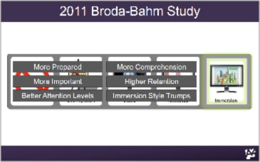 Beyond merely knowing that visual support must be used at trial, we know that you need to use an immersive technique when arguing and showing graphics. Jury consultant Dr. Ken Broda-Bahm performed a study on mock jurors by using five different techniques for presenting oral argument (opening statements): (1) no graphics at all; (2) old-school flip charts; (3) professionally made, static graphics that were only sporadically shown; (4) fancier professionally made animated graphics still sporadically shown; and (5) a combination of 3 and 4 where the jurors were always given something to see during the presentation. Surprisingly, only the last technique, the immersive style, made any significant improvement in persuasiveness.
 Another important point is that we know that your argument needs to be structured as a story. People are hard wired to enjoy and expect stories. Storytelling literally gets the teller (you) and listener (juror) on the same mental wavelength. By this I mean that the very same areas of the brain are activated in synchronicity in the storyteller’s and listener’s brains – they share thinking patterns. Also, good storytelling causes release of oxytocin, called the trust molecule, in listener’s bodies. This physical reaction to a good story makes an audience more likely to be sympathetic and ready to “help,” which is what you want a jury feeling when your case is presented.
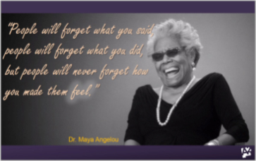 And this word – feeling – is the key to victory at trial. As Dr. Maya Angelou famously said, “[p]eople will forget what you said, people will forget what you did, but people will never forget how you made them feel.” This is doubly true for jurors and litigators. Jurors will most remember how they felt about you and your case, and thus, about your client, and will decide your fate based on that feeling, sprinkled with some of the salient facts from the trial that fit with their conclusion on how the case should turn out. Make them feel like you won.
All the above is essential knowledge to be persuasive at trial. You need to tell a compelling story, you need to support that story with litigation graphics, and you need to show those litigation graphics in an immersive way. But, how do we as litigators do this in real life? Here’s how:
When I explain these concepts to other litigators, and I do this all the time, I analogize trial presentation to the television news, where there are two kinds of presentation graphics. We are all well acquainted with the broadcast news and are comfortable with the style and format of its typical (really universal) presentation. The news is an informative presentation that always uses an immersive graphical style to tell story after story after story. The goal of the broadcast is usually to quickly inform you as a consumer of mass media, probably to evoke some emotion, and sometimes to persuade. What do we see news broadcasters doing and how can we adopt a similar style to be persuasive in presenting trial argument?
 Take a good look at the photo here of anchor Brian Williams of the NBC Nightly News. Most news reports, like those presented by Williams, are dominated by the anchor speaking directly to us through the camera. Almost always, next to the anchor’s head is a large graphic, which is almost always static, but for (maybe) some sort of animated entrance for the graphic. This is what you see in this photo of Brian Williams reporting on an airline crash.
You obviously cannot hear anything of what Williams was saying because I’ve only provided you a picture, but you “know” what he’s saying nonetheless. You’ve already created some “story” in your own mind explaining what you’re seeing in the picture – to explain the emotions evoked in you by seeing the image of the crashed plane and the look of concern on Williams’s face. Your concocted story may or may not be correct, but the mere fact that you’ve developed one for yourself is proof that everything I’ve said above is correct.
This is how you’ll use the lion share of your trial graphics during your immersive presentation. You’ll make your points and tell your client’s story orally and show the jury graphics that support those point, storylines, and themes. However, this is not what most litigators think of when they think they need litigation graphics. What they typically think of is the weather man.
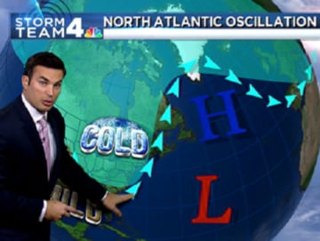 To continue with my news report analogy, there is a wholly different kind of litigation graphic that will be interspersed within your larger visual courtroom presentation. These second type of graphics are more complex, are directed to more complicated subject matter and issues, and are expressly spoken to by the presenter (you). These types of graphics are like those used by Washington, DC’s NBC4’s Doug Kammerer here in the photo of him doing a weather report and forecast.
Kammerer is standing in front of his graphics (actually, they are superimposed over a green screen in production, but he can see what he’s doing) and discussing them in detail. You see that he is pointing to the jet stream pattern and the cold front it’s pulling down from Canada into the United States. You know what that weather pattern is doing – it is making us very cold – because the colors and graphics tell us that.
He’s looking us in the eye, but talking about the complicated weather patterns graphically displayed behind him – he’s explaining complex things to us in a way that we understand even though we are not meteorologists.
Here’s America’s beloved weatherman, Al Roker of the Today Show explaining how to talk to a graphic like this:
What’s the benefit of following the “TV news” style of presenting? First, it allows you to use an immersive visual technique without it seeming over-done. Second, you’ll be presenting your case to the jury in a way that they expect and are very comfortable with. You’ll be able to connect with your jurors, you’ll make the trial more entertaining and enjoyable for them, and they’ll appreciate it. As Dr. Angelou said, they’ll remember how you made them feel, and it will have an impact when they decide the outcome of our case. If you choose not to follow the advice of this article you risk alienating, confusing, irritating, boring, or otherwise losing your jury-audience. This is disastrous for trial lawyers.
What’s the benefit of following the “TV news” style of presenting? First, it allows you to use an immersive visual technique without it seeming over-done. Second, you’ll be presenting your case to the jury in a way that they expect and are very comfortable with. You’ll be able to connect with your jurors, you’ll make the trial more entertaining and enjoyable for them, and they’ll appreciate it. As Dr. Angelou said, they’ll remember how you made them feel, and it will have an impact when they decide the outcome of our case. If you choose not to follow the advice of this article you risk alienating, confusing, irritating, boring, or otherwise losing your jury-audience. This is disastrous for trial lawyers.
When litigators come to us for the first time seeking litigation graphics for their trial, they usually say things like “I need a graphic that shows ________” (fill in this blank with any complex issue that’s hard to explain) rather than I need a visual presentation that supports this story, these themes, and tracks this opening statement. Once they get it, though, it’s the later they understand they really need and want. The complicated issues in any litigation present themselves more obviously to us and are, thus, the first things litigators realize they need to educate a jury about. It’s more difficult to unveil the heart of the case, develop and story around it (why are we really here in court?), and support that story visually and in conjunction with the important evidence of the case. Following the path I’ve set out above, developing a story, committing to supporting that story with an immersive visual presentation, and presenting the story and visuals in the “TV news” technique will make you a better litigator.
Other articles and resources on A2L Consulting's site related to litigation graphics, storytelling for persuasion, trial graphics and demonstrative evidence:
- 21 Reasons a Litigator Is Your Best Litigation Graphics Consultant
- 16 PowerPoint Litigation Graphics You Won't Believe Are PowerPoint
- 10 Things Litigation Consultants Do That WOW Litigators
- 6 Studies That Support Litigation Graphics in Courtroom Presentations
- FREE Webinar: Persuading with PowerPoint Litigation Graphics
- FREE Webinar: Storytelling as a Persuasion Tool
- 10 Things Litigators Can Learn From Newscasters
- FREE Webinar: Patent Litigation Graphics
- FREE Download: Using Litigation Graphics
- 7 Questions Will Save You Money with Litigation Graphics Consultants
- 16 Litigation Graphics Lessons for Mid-Sized Law Firms
- 13 Reasons Law Firm Litigation Graphics Departments Have Bad Luck
- FREE Download: Why Using a Litigation Consultant is Beneficial to You
- FREE Download: Storytelling for Litigators
- The 12 Worst PowerPoint Mistakes Litigators Make
- 6 Trial Presentation Errors Lawyers Can Easily Avoid
- The 14 Most Preventable Trial Preparation Mistakes
- Trial Graphics Dilemma: Why Can't I Make My Own Slides? (Says Lawyer)
- Why Reading Your Litigation PowerPoint Slides Hurts Jurors





Leave a Comment