 by Ken Lopez
Founder/CEO
A2L Consulting
I love a good trial timeline whether it's a printed large-format trial board or whether it's in PowerPoint form. This goes for my colleagues here at A2L, as well. In fact, we love timelines so much that we've even produced a book with more than 30 types of trial timelines illustrated.
Timelines are used as demonstrative evidence in just about every trial. They serve an obvious purpose of orienting judge and/or jury to the order of events and how those events relate to one another. It's the one exhibit that helps make sense of it all, particularly in a complex case.
As our trial timine book discusses, a timeline does not have to be limited to simple chronologies. In fact by incorporating graphs, photos, color schemes and more, a timeline can transmute from being simply informative to being quite persuasive.
When I first launched A2L back in the mid-1990s, timelines were almost exclusively printed on large trial boards. There were many advantages to this approach. Sometimes we had to use as many as five tiled boards standing next to each other to make a complicated case make sense and show many events over a long period of time.
Relative to the 1990s, very few printed trial boards get produced these days, although we still prepare a good number each month. One of the best exhibits to use a printed trial board for is the timeline, because you can often leave it up in front of a jury or judge and help them stay oriented to your case. However what happens when you can't or don't want to print a large timeline on a board?
There are a couple of good techniques for designing timelines in PowerPoint, Prezi or Keynote that allow you to create the illusion of a much bigger canvas than you can otherwise show legibly in PowerPoint. I've written about this approach in Prezi before, but I continue to advise against using that program at trial because of issues people have with motion sickness.
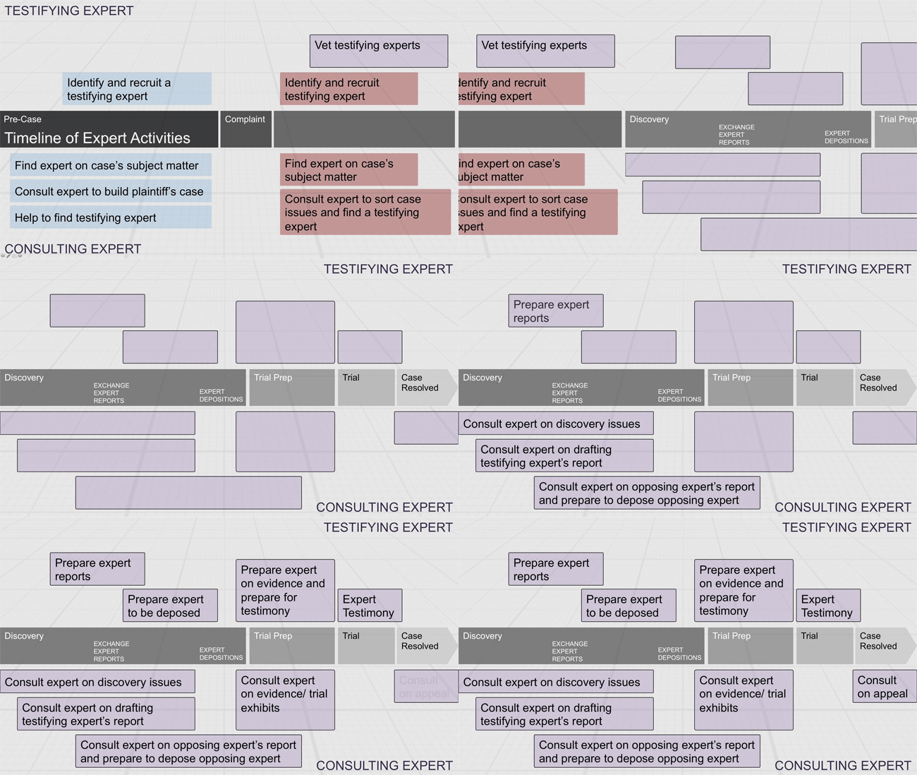
The sliding timeline technique is a great method to use when you have many events over a long period of time. By creating a transition between slides that mimics sliding a large piece of paper across the screen you help keep your audience oriented and in touch with the passage of time. Have a look at the simple two-slide example below to see what I mean.

In this PowerPoint trial timeline that compares the role of testifying experts and consulting experts, we move along the litigation lifecyle in a case from complaint to discovery by sliding the timeline across the screen using a push from right transition. I think it does a good job creating a fluid and elegant transition, and it helps the jury clearly appreciate when you're going forwards and backwards in time. It's a simple lesson, but it is one I see frequently underutilized. Dig into the articles, books and webinars below to learn more.
Other articles and resources from A2L Consulting discussing trial timelines, printed trial boards, PowerPoint and litigation graphics generally:
- Trial Timelines and the Psychology of Demonstrative Evidence
- 12 Ways to Eliminate "But I Need Everything On That PowerPoint Slide"
- Why Expensive-Looking Litigation Graphics Are Better
- How To Use and Design Trial Timelines
- Free Webinar: PowerPoint Litigation Graphics - Winning by Design™
- 5 tips for effective trial timelines
- Using trial timelines to persuade as well as inform
- 6 studies that support using demonstrative evidence
- Using calendars as trial timelines
- 16 PowerPoint Litigation Graphics You Won't Believe Are PowerPoint
- Don't ONLY be a timeline trial lawyer


Leave a Comment