by Ryan H. Flax, Esq.
(Former) Managing Director, Litigation Consulting
A2L Consulting
We have discussed four important tips for maximizing persuasion during your opening statement (See parts 1, 2, and 3). The last tip is the use of demonstrative evidence in connection with the statement.
You need to be aware that most people, other than lawyers, are visual preference learners. Most lawyers, in contrast, are auditory or kinesthetic preference learners.1 Most people teach the same way they prefer to learn – so lawyers typically teach by lecturing, since that is most comfortable for them. But this strategy does not help with the majority of jurors, who would prefer to be taught visually, at least in part. So bridge this courtroom gap with demonstrative evidence, including litigation graphics.
You cannot just relay information and be persuasive. A study has shown that lawyers who use PowerPoint in their opening statements enhance persuasion though jurors’ central and peripheral processing.2 In that study, the use of litigation graphics made the lawyers appear (in jurors’ eyes) more competent, more credible and more likable, helped jurors retain information better, and resulted in better verdicts.
Another study shows that you cannot just show some graphics once in a while during your opening statement, but you must immerse the jury in visuals throughout the entirety of your opening.3 Immersion means constantly providing visuals for an audience throughout a presentation.
 Ken Broda-Bahm, Ph.D., tested this by presenting opening statements to jurors accompanied by no graphics, old-school-style flip chart graphics, sporadically shown professionally made graphics, and sporadically shown animated graphics. Surprisingly, he found that none of these techniques were persuasively distinguishable. Only when he used the immersion technique did he find that persuasion was significantly improved. With this technique, jurors were found to be more prepared on the evidence, they paid more attention, they felt the evidence was more important, they comprehended better, and they retained information longer.
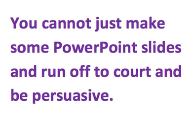
However, you cannot just make some PowerPoint slides and run off to court and be persuasive. The easiest and most common way lawyers make their own trial presentations is by outlining or scripting an argument in Word and then copying and pasting that script into PowerPoint. This is worse than ineffective and all but promises to harm your case.
Interestingly, a recent study shows that the perceived cost of something matters.4 The study researched the effectiveness of placebos on patients with Parkinson’s disease and found that placebos were effective but that patients who believed they were getting more expensive drugs got significantly more effectiveness from their placebos. This translates to trial persuasiveness in that if your trial graphics seem expensive, jurors will believe that you and your case are better, all things being equal.
Never simultaneously say what you’re also showing in a graphic (this does not necessarily go for something you’re affirmatively quoting). A well-researched phenomenon called the redundancy effect happens when you do this and the result is your jurors’ brains are switched off and they stop taking in any information at all.5 You’ve subjected them to a cognitive load that their brains cannot handle and, so, they turn off. This is not desirable in an opening statement.
And never use bullet point lists as your graphics.6 No great presenter does this. This is often the result of the self-prepared graphics that I mentioned a minute ago where you transfer your script of outline to slides. Using bullets probably means your presentation is “text-heavy,” which is a barrier to effective communication. Also, people can read and understand faster than they can listen to you and understand: 275 words per minute vs. 150 words per minute. By using bullet lists you’ve challenged your audience to read your slides before you can explain their content, and your audience will win every time and stop listening.

The “Don’ts”
Finally, as an extra bit of info, here are some things to avoid in opening statements.
Don’t re-introduce yourself. Don’t waste your first 90 seconds of opening by re-explaining who you are. It’s likely that the judge has already done this or that the jury has heard it already. Even if that’s not the case, wait a few minutes to do it if it must be done.
Don’t pander. Don’t tell the jurors how important their job is or how great it is that they’re doing their civic duty or how thankful you are that they’re here. This is patronizing, and they’ll know it and resent you for it. If you must, simply say that you appreciate their time and are going to try and get them through the trial as efficiently as you can.
Don’t explain how an opening statement works. Don’t explain that your statement isn’t evidence. The judge might do that, but you sure as heck shouldn’t. Most likely, your jurors won’t distinguish between actual evidence, demonstrative evidence, and attorney argument. Why enlighten them?
Don’t tell jurors how proud you are to represent your client. I hear this so often and cringe every time. It’s not persuasive. It sounds insincere. It’s B.S. and jurors will know.
Don’t oversell your case. If you know you cannot prove something, don’t say you can. Promising more than you can deliver will hurt your case and, potentially, constitutes reversible error.
Other A2L Consulting articles and resources related to persuading with graphics, opening statements and using words and pictures in a complimentary way:
- 12 Reasons Bullet Points Are Bad (in Trial Graphics or Anywhere)
- Why Reading Your Litigation PowerPoint Slides Hurts Jurors
- 12 Ways to SUCCESSFULLY Combine Oral and Visual Presentations
- 6 Studies That Support Litigation Graphics in Courtroom Presentations
- Why Reading Bullet Points in Litigation Graphics Hurts You
- The 12 Worst PowerPoint Mistakes Litigators Make
- 16 PowerPoint Litigation Graphics You Won't Believe Are PowerPoint
- 16 Litigation Graphics Lessons for Mid-Sized Law Firms
- 6 Trial Presentation Errors Lawyers Can Easily Avoid
[1] Attorney Communications Style Study (Jan 2, 2007) (available at http://www.a2lc.com/pressarticles/presslearningstudy.html).
[2] Jaihyun Park and Neal Feigenson, Effects of a Visual Technology on Mock Juror Decision Making, Appl. Cognit. Psychol. 27:235-46 (2013)
[3] Dr.Ken Broda-Bahm, Persuasive Litigator: Show, don’t Just Tell, http://www.persuasivelitigator.com/2011/07/show-dont-just-tell-continuity.html (2011).
[4] Espay et al., Placebo Effect of Medication Cost in Parkinson Disease, Neurology vol. 84, No. 8, 794-802 (Feb 24, 2015).
[5] See, e.g., Mayer et al., Cognitive Constraints on Multimedia Learning: When Presenting More Materials Results in Less Understanding, J. Edu. Psych. Vol. 93, No. 1, 187-98 (2001).
[6] See, generally, research by Dr. Chris Atherton (e.g., https://youtu.be/OwOuVc1Qrlg).


Leave a Comment