Bullet points, especially when they’re found in PowerPoint slides, have become the cliché of the trial graphics and presentation worlds. There’s no good reason to use them, and plenty of reasons not to. For many, bullet points signal a boring presentation is about to begin or one is about to hear a presenter who, like someone on a vintage cell phone, is detached from modern presentation style.
Bullets are not just aesthetically bothersome. The A2L Consulting trial graphics team, trained in cutting-edge theories of conveying information, believes that text-heavy presentations riddled with bullet points also do harm to the persuasion process.
Garr Reynolds, a leading writer on the art and science of presentation, says in Presentation Zen, “Bullet-point filled slides with reams of text become a barrier to good communication.”
Chris Atherton, a cognitive psychologist who has scientifically studied bullet points, writes, “Bullets don't kill, bullet points do.”
Attorney Mark Lanier, commenting on his $253 million Vioxx verdict after following the no-bullets advice offered by Cliff Atkinson, another top presentation theorist and author of Beyond Bullet Points, said, "The idea that you could speak for 2 1/2 hours and keep the jury's attention seemed like an impossible goal, but it worked. The jury was very tuned in."
Below is a list of reasons and resources that support the reality that bullet points do not belong in your presentation – whether a trial graphics presentation or something else.
- People read faster than they hear -- 150 words per minute spoken vs. 275 words per minute reading. People will read your bullets before you can say them and stop listening. If jurors are spending time (and brain-power) reading your trial graphics presentation, they are not listening.
- Chris Atherton's work confirms that bullet points do real harm to your presentation. Her scientific study validates the notion of eliminating bullet points and she lectures on the topic in the video below.
- The redundancy effect describes the human mind’s inability to process information effectively when it is receive orally and visually at the same time. If you speak what others are reading in your bullets, because of the redundancy effect, you end up with less comprehension and retention in your audience than if you had simply presented either 100% orally or 100% visually. http://www.a2lc.com/blog/bid/26777/The-Redundancy-Effect-PowerPoint-and-Legal-Graphics
- Authorities on the subject agree bullets are problematic. Read Presentation Zen or pick up Garr Reynolds' tips in the video below. Also see here http://beyondbulletpoints.com/ and here: http://sethgodin.typepad.com/seths_blog/2007/01/really_bad_powe.html
- Watch great presentations and see what they are doing right (and note that they do not use bullets). Here are three stand-out and bullet-point-free presentations:
Hans Rosling's TED Talk presenting data in an appealing way.
Steve Jobs introduces the first iPhone in 2007.
Al Gore revisits his Inconvenient Truth theories.
- The more you use bullets the more people will judge you as outdated. If you are making a trial graphics presentation and your case relates to technology, this is unforgivable, but for any case this will not be helpful. Remember Chris Atherton's work from point 2 above.
- If you are using bullets to talk about numbers, there is usually a very easy workaround. For example, here is an easy way to handle changing metrics:
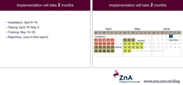
 and an easy way to handle dates:
- Understand how the brain works. Developmental Molecular Biologist Dr. John Medina explains briefly one of his 12 "brain rules" from his book of the same title. Here, he explains that vision trumps all other senses and pokes fun at bullet points in the process.
Vision from Pear Press on Vimeo.
- Whether most of your presentations are for judges and juries or whether they are for management, learn how to tell better stories; take a look at one of our most popular articles: http://www.a2lc.com/blog/bid/53536/10-Videos-to-Help-Litigators-Become-Better-at-Storytelling
- Remember, if you are using bullet points, people are likely to tune you out as boring when you most want them to be paying attention.
- Consider using Prezi instead of PowerPoint as we explained in this popular post, and illustrated in A2L's well-circulated Prezi sample that explains Collateralized Debt Obligations (CDOs): http://www.a2lc.com/blog/bid/40453/Beyond-PowerPoint-Trial-Presentations-with-Prezi-and-Keynote
- Finally, while A2L Consulting would be thrilled to help, here are 74 ways to remove bullet points on your own.
- 6 inspiring non-bullet point options
- 41 great alternatives to bullet points
- 4 before bullet point and after bullet point examples
- 4 great before and after bullet points from Garr Reynolds (see slides 5 through 8 - although his entire presentation is helpful)
- 7 ways to replace bullet points altogether
- 12 more ways to avoid bullet points
We believe that a well-crafted presentation -- whether in trial graphics or in the corporate world -- will change the way people make decisions. Regardless of your audience, there is something you want from them. Make your presentation the best it can be using the latest techniques.


Leave a Comment