A fascinating new study in the field of social psychology indicates that the type font in which an argument is presented has an effect on how convincing it is. For trial graphics consultants and litigators alike, this is potentially very big news.
The study, published in the Journal of Experimental Social Psychology [pdf], tested the effectiveness of political arguments in convincing people to change their minds – and also tested people’s attitude to a hypothetical defendant in a mock trial.
It is well known that people tend to disregard arguments that vary from their own longstanding views and to take note of arguments that support their views. This phenomenon is known as confirmation bias. For litigators and trial graphics consultants, we know this means judges and jurors will only closely pay attention long enough to confirm what they already believe - so, we need tactics to overcome this bias.
The idea behind such research was to present the arguments in hard-to-read type faces (e.g. light gray bold and italicized Haettenschwiler, and, the scorn of all design professionals, Comic Sans italicized) and to see whether confirmation bias was just as strong as when the arguments were presented in normal, easy-to-read type (Times New Roman).
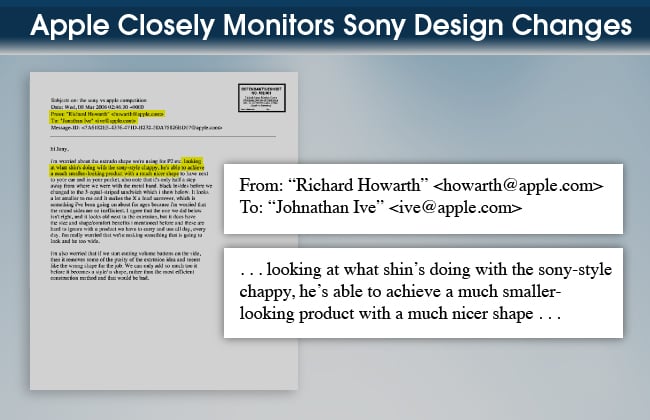
Below are two sample trial graphics that compare two of these fonts. The first image uses easy-to-read Times New Roman for the callout.

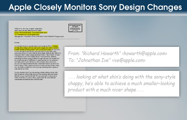
And the second uses hard-to-read light gray Comic Sans italicized.

The result of the study was that confirmation bias was moderated by the use of the hard-to-read type. Normally, those who believed the defendant was guilty would stay with that view after reading the arguments pro and con, and the same would be true of those who thought the defendant was innocent. They wouldn’t change their views.
But with the hard-to-read type, more people began to seriously consider the arguments against their initial position.
"We showed that if we can slow people down, if we can make them stop relying on their gut reaction -- that feeling that they already know what something says -- it can make them more moderate; it can have them start doubting their initial beliefs and start seeing the other side of the argument a little bit more,” said graduate student Ivan Hernandez, one of the leaders of the study.
What might this research mean for trial graphics consultants and litigators?
First, there’s no question that confirmation bias exists among jurors. A juror who, because of the opening statement or for some other reason, approaches the trial evidence with a certain perception, is unlikely to change that perception. That is one of the trial lawyer’s toughest challenges – to reach a juror (or judge) who starts out against his or her client and to get that juror to reconsider.
This study seems to say that hard-to-read typography will “disrupt” that bias and lessen its persistence, perhaps by making people “slow down.” This may affect the preparation of litigation graphics by trial graphics consultants by forcing them to consider whether a bias against their clients exists, and if so, making exhibits more, not less, difficult to read. This might mean that text call-outs from scanned documents should not be retyped and that persuasive titling should be in harder to read fonts.
We will begin testing these findings with our mock juries, and if they prove successful, testing them at trial as well. Anything to make jurors (metaphorically) stand up and listen (that is within ethical and legal boundaries) is fair game for trial graphics consultants. We will keep you posted.
More useful materials from A2L's trial graphics consultants:
- Free Download: A Guide to Making Great Trial Timelines
- Free Download: The BIG Litigation Interactive eBook
- 9 Trial Graphics Budget Saving Techniques
- 11 Tips for Trial Graphics in Patent Litigation
- Never Use Bullet Points - Here's Why
- 12 Questions to Ask When Hiring a Trial Graphics Consultant


Leave a Comment