A lot of litigators express confusion about how best to use litigation graphics. Top litigators are asking smart questions like:
- Should I pause to let a jury take in a graphic before speaking?
- Should I turn off my presentation while I am speaking?
- How much text should I put on a slide?
- How much of my slide should I read?
- And, what's all this negative talk about bullet points (especially when the author of this very article uses bullet points to talk badly about bullet points)?
In many cases, it is litigation graphics consultants who are to blame for this general state of confusion. For decades, litigation graphics consultants have been telling litigators that combining oral and visual messages will increase judge and jury information-retention and understanding. That's correct, but most litigators have never been taught how to combine the two exactly, and getting good results depends entirely on the how.
To drive the home the need to use courtroom visuals, litigation graphics consultants have used science to emphasize their message. Most of us have heard of or talked about the much-cited Weiss-McGrath study. Among other things, it is reported to conclude that combining oral and visual messages will result in a 650% increase in people's retention of information.
So, what have litigators done in the face of all of these confusing messages? They listened and they adapted to the changing times.
Litigators started using graphics in earnest over the past twenty years. Printed trial boards were used at first, and then PowerPoint litigation graphics arrived in the mid-2000's. Despite these efforts to improve courtroom communications, I fear that many times the way oral and visual presentations are being combined is doing more harm than good.
Why? Well, I believe three key things have gone awfully wrong:
- Over the last 20 years, very few litigators received guidance from litigation graphics consultants about what works when combining graphics and oral communications.
- Without real guidance, litigators made an understandable mistake by using litigation graphics as a means to read bullet point filled slides to jurors.
- As for the science, despite thousands of citations to it, there never was a Weiss-McGrath study. Still cited by many trial graphics firms as their Raison d'etre, this report was recently proven to never exist by a diligent law libararian [p27-30 of this pdf]. Fortunately, the science supporting the use of litigation graphics turns out to be better than what this mythological study reported, and I'll describe it below. The fact that this study never existed just underscores the confusion that both litigation graphics consultants and litigators have suffered through these past 20 years.
So, I think we find ourselves in a time where litigators are trying hard to figure out what works best when using visual evidence, and litigation graphics consultants are not doing enough to help them. My hope is to remedy this problem by describing what we modern litigation graphics consultants mean when we promise that you will get better results if you do combine oral and visual presentations - the right way.
Here are 11 ways you should combine your spoken presentation and your visual presentation to achieve maximum persuasion:
1. Forget about bullet points in the way we've come to expect them (like the slide below). Yes, at A2L, we talk about bullets every third article or so, and for good reason. If you read your bullets (and you're likely to do so if you use them) you are almost certainly worse off than if you had not used litigation graphics at all. See these 11 A2L articles about bullet points for more. This applies only to presentations, not written materials where bullets can be quite valuable.

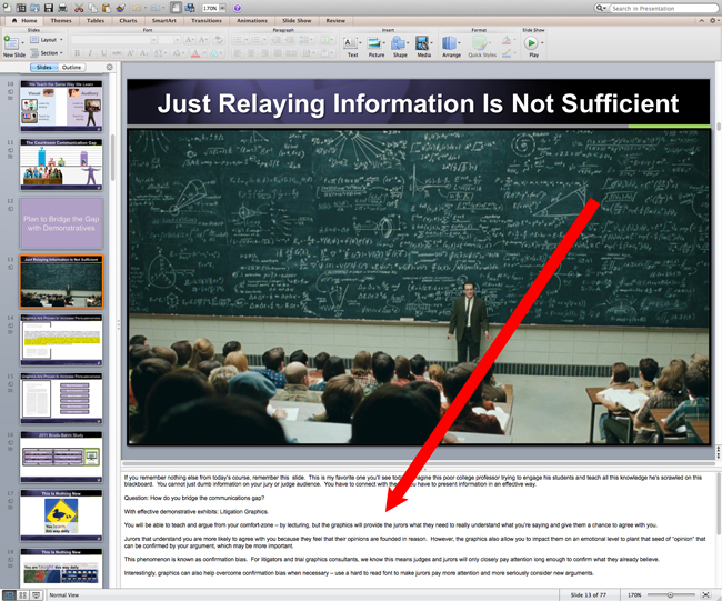
2. Use speaker notes. Whether you simply print this information out or you use a dual screen set-up when you project your slides, having your notes available within PowerPoint is simple. Simply place them in this area shown below, and you will be able to print these notes next to your slides or print them alone. Either way, this will help you avoid putting everything you want to say on your slide.
3. Never duplicate your spoken message on screen. Instead of reading your slides, plan to have some of your message spoken have some of it be visual. Try to think of yourself as a popular on-air meteorologist. While the weather forecast is easily conveyed with a simple graphic like the one below, it helps to hear additional details, story, and meaning from a person. It is a much more memorable experience to look at this chart while hearing someone say, "Wednesday's snowstorm will be crippling for parts of the DC region."

4. Create some graphics that you can speak to. It's okay - indeed it is possibly better - if you have a graphic that needs some explaining. It will give you something important to say and enhance your message overall. For example, this circa 1997 litigation graphic below does not stand on it's own since you really cannot tell what it means. However, if you explained, using this chart, that the standard of care requires a differential diagnosis (i.e. narrow the cause of several symptoms to a specific disease whenever possible) and Dr. Smith instead diagnosed and treated nine separate problems, you get a clear and memorable picture.

 5. Use the B-Key. Don't leave up or show a slide that is unrelated to what you are saying unless that is an intentional tactic used to distract from what you are saying. The b-key displays a black screen when pressed and returns you to your presentation when pressed again. If you think of a news anchor for a moment, wouldn't it look strange if Brian Williams was talking about the Winter Olympics while there was a video playing of a hurricane over his shoulder? Of course it would. Use the b-key to subtly tell your judge and jury to return their attention to what you are saying, not what you are showing.
6. You don't always need to be speaking, but you probably need to be always showing something. A recent study demonstrated that an immersive style of trial graphics presentation will yield the best results. The results of this study suggest that you should always be showing a visual when you can.
7. Pause. When you bring up a new graphic, let your silence encourage the jury to look at your litigation graphics and soak it in.
8. Subscribe to this blog. This is not (only) a self-serving pitch, I really mean it. If you are in litigation, there are only a couple of blogs that cover this information with real authority. If you are watching what we are publishing, you will stay ahead of others around you. About 3,800 of your peers subscribe already.
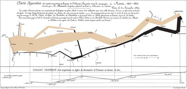
9. One concept per slide. Lots of people talk about the graphic below and how it is a great example of effective information design. It is beautiful, but it would make a terrible demonstrative exhibit at trial. Why? Because there is way too much information shown on a single graphic. At trial, keep it simple - one concept per slide. If you have to use a chart like this one, build it up over a number of slides and then display it as a printed trial board.
10. Minimize text. In general, never use less than 28 point font size in PowerPoint, and you will be in good shape. This rule will force you to limit the amount of text that you use, and will keep your presentation legible at the same time. You don't want to try to mimic a Steve Jobs iPhone launch exactly, but you want to limit your text as much as possible.
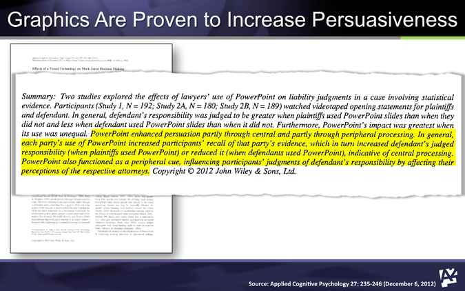
11. Keep up with the science. Academics are turning their attention how one best persuades with graphics. In 2012, one of the most important studies to date was released. It showed specifically that the use of PowerPoint increases persuasiveness. Part of the abstract is shown below. You'll find this article helpful too: 6 Studies That Support Litigation Graphics in Courtroom Presentations.
12. Practice, practice, practice. Don't spend time and money developing a great argument and great litigation graphics only to fail to practice combining the two. We advocate a 30:1 practice to performance ratio.
Combining oral and visual messages is the best way to communicate with your jury. This is based on commonsense, experience and good science. Many lawyers have never been taught the right way to do it, and I hope this article has been a help. I would welcome hearing from anyone interested in learning more or talking about how this applies to a specific trial presentation challenge.
Other A2L Consulting articles about litigation graphics consultants, PowerPoint use, and how best to combine oral and visual trial presentations include:
- Free E-Book Download: Using Litigation Graphics to Persuade and Win
- Free E-Book Download: Designing a GREAT Visual Presentation
- Free Webinar - Watch Now: Storytelling in Litigation
- 6 Studies That Support Litigation Graphics in Courtroom Presentations
- Why Reading Bullet Points in Litigation Graphics Hurts You
- The 12 Worst PowerPoint Mistakes Litigators Make
- 16 PowerPoint Litigation Graphics You Won't Believe Are PowerPoint
- 16 Litigation Graphics Lessons for Mid-Sized Law Firms
- 6 Trial Presentation Errors Lawyers Can Easily Avoid
- 21 Steps I Took For Great Public Speaking Results


Leave a Comment