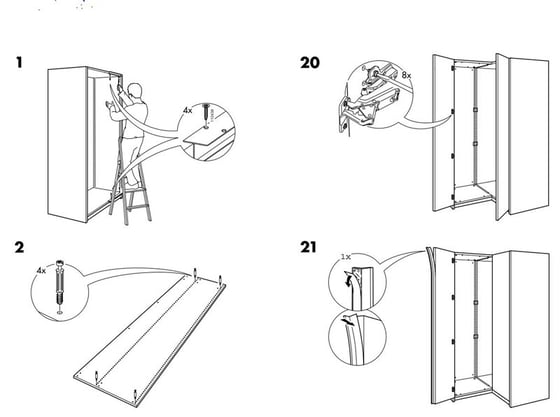
At some point in our lives, many of us, perhaps most of us, have assembled a piece of IKEA furniture. Whether it was for that first apartment, your vacation home, or your kid's dorm room, it's something of a right of passage. If you have done this assembly work with your significant other, it's often a test of the relationship too.
IKEA furniture is inexpensive, in part, because of the way it is shipped and packaged. It is unassembled, it fits into a small package, and the purchaser must assemble it.
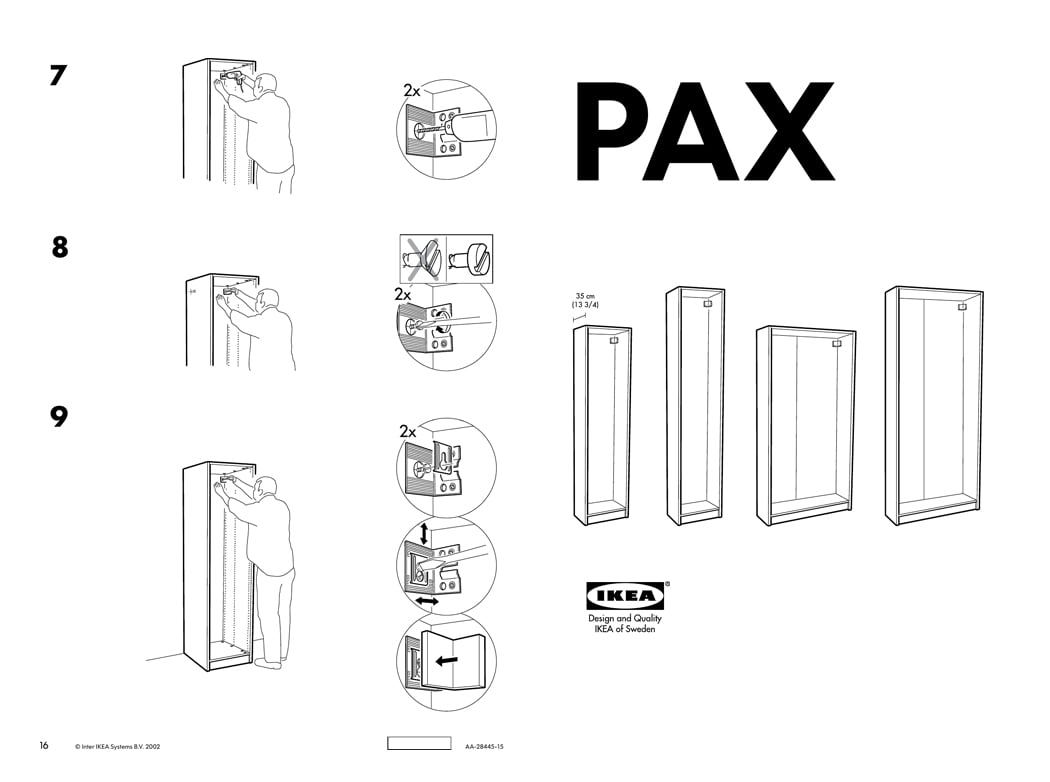
The instructions that come with the products are notoriously complicated, although they are quite well designed. In recent years, IKEA has gone a step beyond the printed instructions of old. They now publish videos of how to assemble a product, and they are really quite good.
Hearing someone complain recently about having to follow the printed instructions got me thinking about juror communications and best practices when it comes to preparing litigation graphics. Of course, right? Here are three ways IKEA assembly instructions and litigation graphics can be similar:
- The Worst: Having your significant other tell you what to do and how to assemble the product is a lot like a trial attorney lecturing a jury with no visuals at all. See, 6 Studies That Support Litigation Graphics in Courtroom Presentations.
- Okay: Following the printed IKEA instructions is a bit like watching PowerPoint slides prepared by a member of the trial team. They are well-intentioned but not nearly as helpful or persuasive as they could be. See, 12 Reasons Litigation Graphics are More Complicated Than You Think.
- Pretty helpful: Watching an IKEA-produced assembly video (see below) is a lot like watching a professionally prepared opening statement, closing statement or expert witness presentation created by a litigation graphics firm. See, Why You Need a Litigation Graphics Consultant.
Below is a static image of the assembly instructions for the IKEA Pax Wardrobe. Below those static instructions is an IKEA-produced video of the same instructions. Which one would you rather follow?

While I find the video version to be much easier to follow, I have to say that if it were me, I'd rather combine the video version plus the printed version. To me, that is a lot like an attorney who combines the spoken word with a presentation that enhances their message. Of course, we've written about this topic, and I think this article is one of the most important for trial attorneys to understand as they think about their trial presentation: 12 Ways to SUCCESSFULLY Combine Oral and Visual Presentations.
In recent years, the how-to video has become more popular than ever. Whether you want to make a souffle, repair your car, or diagnose and fix that error code on your dishwasher, there is very little that you can't find on YouTube now. Just as memorization of facts has become less necessary, trade skills and experience have become less important as well. After all, if our time is not better used elsewhere, all we have to do is Google the answer to a problem and end up looking like a hero when we complete the task. That's pretty compelling.
There are exceptions to this of course. Creativity and problem solving are tough to reproduce in a how-to video (or by a computer). That's part of the reason why trial lawyers won't be replaced by computers in the near future and litigation graphics consultants won't be replaced by trial lawyers any time soon either. Author Dan Pink discusses these heady topics at length in his breakthrough book, A Whole New Mind: Why Right-Brainers Will Rule the Future, which happened to discuss A2L and its work in the legal industry (then known as Animators at Law). See Daniel Pink, Conceptual Thinking and Trial Consulting.
So, as you think about preparing your trial presentation, do you want it to land on your audience like a significant other telling you how to think about something or do you want it to land with your jury like a thoughtfully prepared presentation designed to enhance understanding and clarity?
Other articles about juror communications, litigation graphics, and effective information design include:
- 10 Things Litigators Can Learn From Newscasters
- One Demonstrative Exhibit, One Concept
- How I Used Litigation Graphics as a Litigator and How You Could Too
- Do Professionally Designed PowerPoint Slides Get Better Results?
- 10 Types of Value Added by Litigation Graphics Consultants
- Why Trial Tech ≠ Litigation Graphics
- 5 Things You Lose When You Don’t Have a Litigation Graphic Artist on Site
- Could Surprise Be One of Your Best Visual Persuasion Tools?
- 5 Valuable Lessons From Some Horrible Infographics
- 12 Ways to SUCCESSFULLY Combine Oral and Visual Presentations
- Your Coach Is Not Better Than You – in the Courtroom or Elsewhere
- Don't Use PowerPoint as a Crutch in Trial or Anywhere
- How Valuable is Your Time vs. Litigation Support's Time?
- 5 Demonstrative Evidence Tricks and Cheats to Watch Out For
- Litigator & Litigation Consultant Value Added: A "Simple" Final Product
- 5 Rules for How Simple a Trial Presentation Should Be
- What Does A Case-Winning Trial Graphic Look Like?
- Still Think Persuasion is About Talking While Showing Bullet Points?
- 12 Reasons Bullet Points Are Bad (in Trial Graphics or Anywhere)
- The 12 Worst PowerPoint Mistakes Litigators Make
- 6 Studies That Support Litigation Graphics in Courtroom Presentations
- Litigation Graphics: Timelines Can Persuade Judges and Juries
- Litigation Graphics: It's Not a Beauty Contest
- 5 Problems with Trial Graphics
- The 13 Biggest Reasons to Avoid Last-Minute Trial Preparation
- Why Lawyers and Litigation Graphic Artists Need to Work Together
- FREE DOWNLOAD: Storytelling for Litigators: Building a Great Narrative for Judge & Jury
- FREE WEBINAR: Storytelling as a Persuasion Tool
- Explaining a Complicated Process Using Trial Graphics
- Free Guidebook: Why Should I Work with A2L Consulting?


Leave a Comment