Last month I wrote about trial technology lessons trial lawyers could learn from the impeachment hearings. In that article, I highlighted a (common) technology mistake one congressman made using PowerPoint as part of their effort to question a witness.
As the impeachment hearings moved into the next phase in front of the Judiciary Committee, even more PowerPoint presentations were being used to help question witnesses. Unfortunately, since most of the members of congress are not routinely presenting and persuading with PowerPoint, they made many of the same litigation graphics mistakes that a novice trial lawyer might.
PowerPoint is a funny thing. Anyone can use it (even trial lawyers, paralegals, and associates), but almost no one can use it well when persuasion is the goal. Since anyone can make a slide that looks pretty good, they often don't know they are damaging their persuasiveness in the process of creating a slide. In many trial presentations I see, lawyers who do their own work would have been far better off not using trial graphics at all.
If you are an expert in the field (like the team at A2L), you know there are simply too many rules of psychology, technical challenges, and skill sets to keep track of it all -- unless you do this kind of work every day. We have written about this many times in articles like:
- 12 Reasons Litigation Graphics are More Complicated Than You Think
- 17 Reasons Why Litigation Consultants Are Better at Graphics Than Law Firms
- Trial Lawyers: Only Do What Only You Can Do
In the judiciary phase of the impeachment hearings, I noticed the same kinds of mistakes were made over and over. Many relate to the most common type of litigation graphic -- the call-out. A call-out litigation graphic is one where a portion of a document is highlighted or magnified in someway to draw attention to some aspect of the document, often just some key phrases.
We’ve written about best practices involving call-outs many times before:
- Should You Read Documents Out Loud at Trial?
- Font Matters - A Trial Graphics Consultant's Trick to Overcome Bias
- 3 Styles of Document Call-outs Used at Trial
During a single day of hearings, I noticed at least five key problems that were repeated over and over.
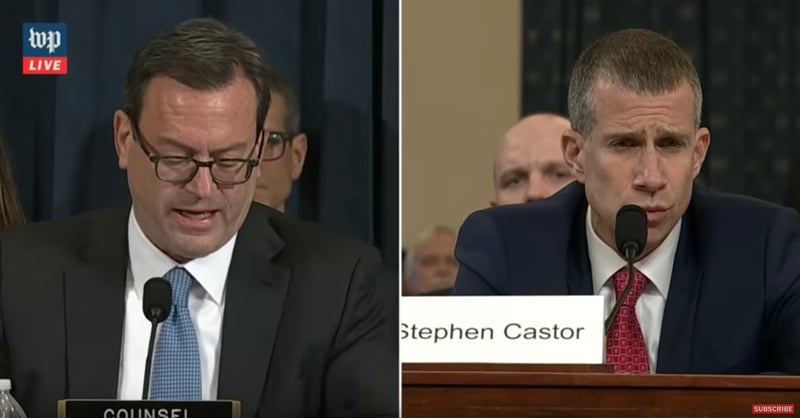
1. Font size. The font size used throughout most of the hearings was generally not large enough. I try to encourage people not to let their font size dip below 28 points in PowerPoint. It’s a common rule that gets broken, but when you see your witnesses or jurors squinting, you know you’ve got an issue (as seen in the photo below).
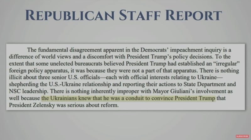
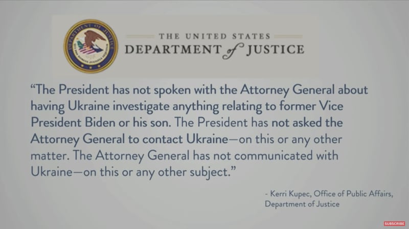
2. Font Clarity. I think many call-outs are better when they are re-typed. Re-typing just makes the text more clear in most cases. I understand that many trial lawyers want a jury to feel that they are seeing the real document, but I believe this is best achieved by showing an image of the complete document and coupling that with a re-typed call-out in a font that matches the document. No one can read the tiny, fuzzy, and low-contrast text in the document call-out below when it is projected onto a screen. The designer would have been much better off showing the slide below, then highlighting, then doing a re-typed version of the text in a call-out that filled the screen.
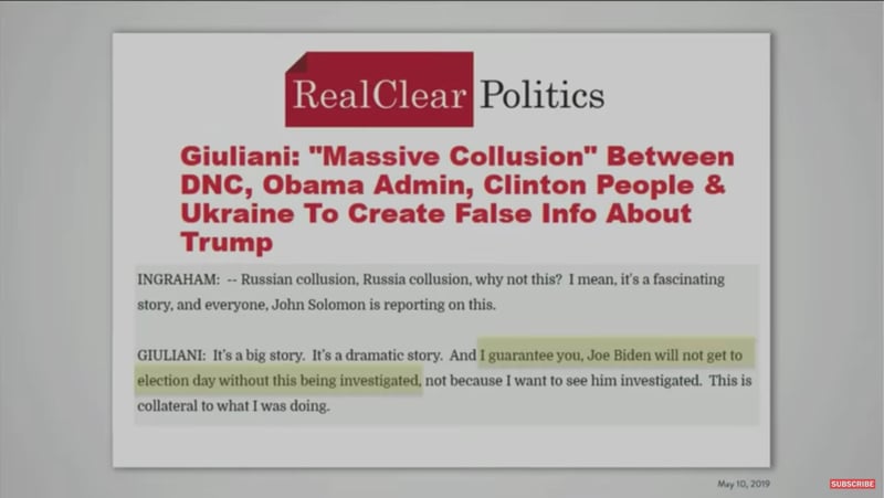
3. Font Embedding. The slides below are a mess likely because of last-minute rushing. Here, the same fonts that are installed on one device were not installed on another. This resulted in the obvious font issues as seen in this slide. The correct solution for this is to always test your presentation machine thoroughly at your presentation site and have a back up. However it is also possible to embed fonts in the PowerPoint so that this sort of thing does not occur when you share a document.
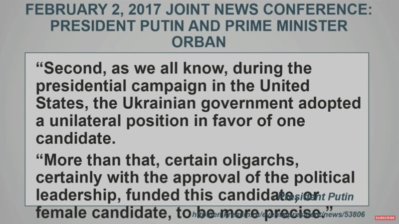
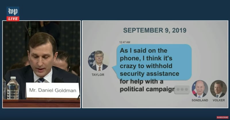
4. Readable Fonts. Many studies have been conducted on what font is most readable for print or electronic presentations. In general, it has long been the case that serif fonts (they have a finished off stroke like Times New Roman) were deemed MUCH more readable for print and san serif fonts (those with even-thickness lines like Arial/Helvetica) were best for the screen. That is still mostly the case if you are projecting your content. However, with the rise of 4K and 8K HD screens, there is no difference between print and screen from a resolution standpoint. Therefore, I recommend moving to a serif font in any situation where high-resolution screens are to be used. These rules need to be considered on a case by case basis depending on how and where you are presenting. In the slide below, the header uses a serif font and the body uses a san serif font.
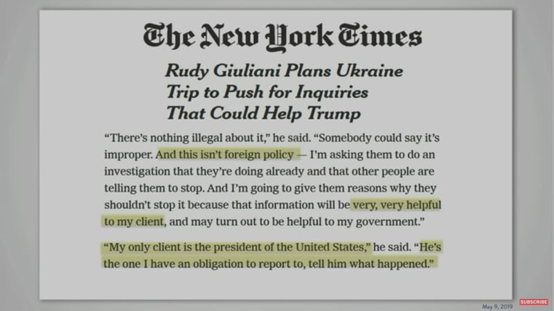
5. Poor Highlighting. It appears that most of the highlighting in these presentations is done on top of the text using a semi-transparent yellow box. The problem with this technique is that it makes the text a little bit harder to read. There are a variety of workarounds for this that professional litigation graphics firms use so that the black text sits in front of the yellow highlight and is completely surrounded by it thus increasing the contrast and making it more legible.
These lessons are the tip of the iceberg, both in regard to what could be learned from watching the impeachment hearings and also what trial lawyers have to think about. Of course, trial lawyers should not have to think about these rules at all. It is sufficient to know that there are many. One hundred years of scientific studies around presentations and persuasion is not what trial lawyers should be thinking about as they prepare for trial. They should be thinking about their arguments and leave the presentation and visual persuasion science to the experts.


Leave a Comment