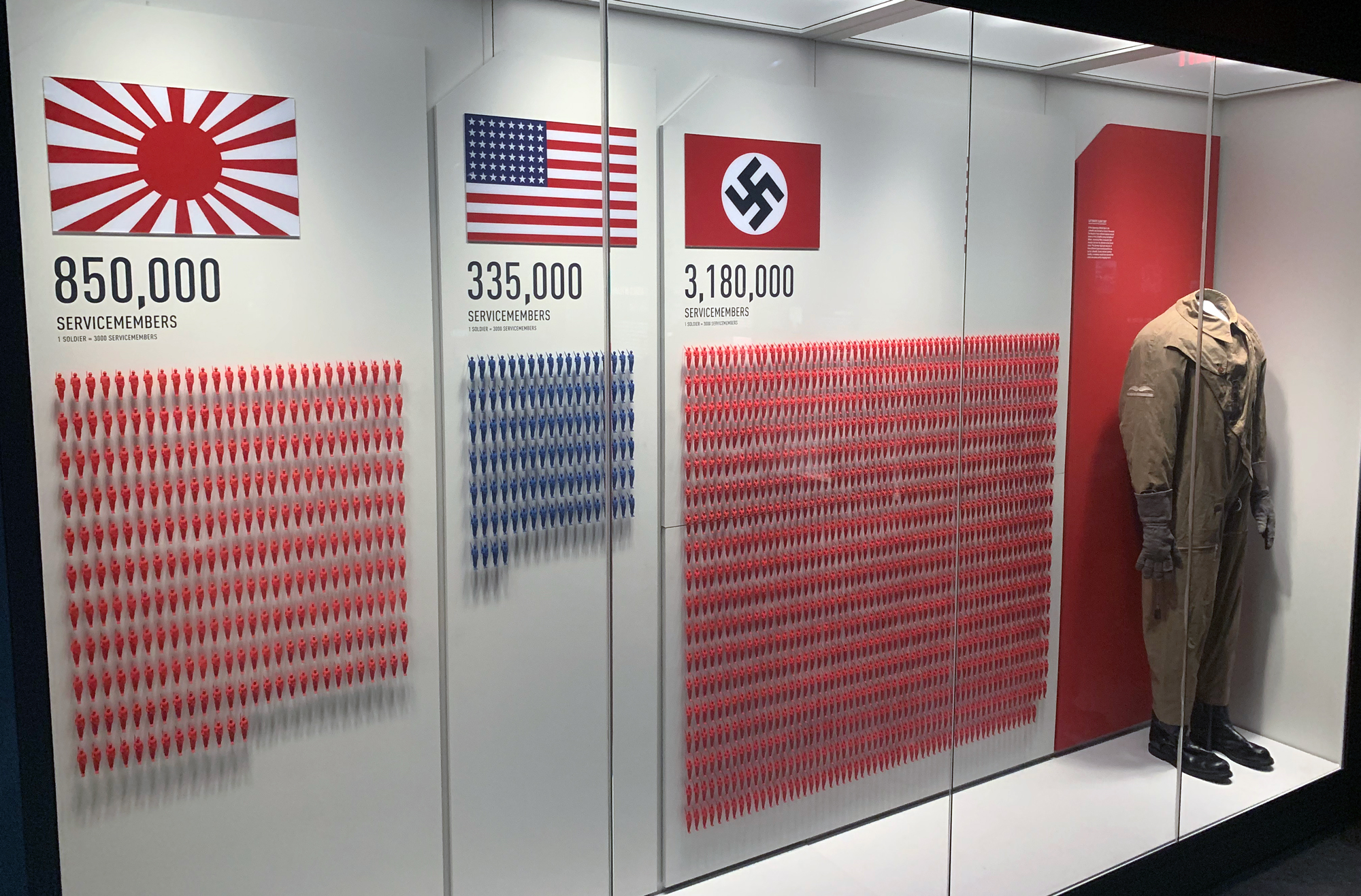
I was in New Orleans recently to speak at the DRI Toxic Torts and Environmental Law Seminar, and while I was in the city, I took some time to visit the National WW II Museum in the downtown area. At the museum, I was struck by a graphic exhibit that showed that in 1941, the United States had only 336,000 soldiers in uniform, compared with 850,000 for Japan and 3.1 million for Nazi Germany. There is a quick and easy lesson here for trial lawyers.
This exhibit told me, as it was intended to do, that the outcome of the war was far from a foregone conclusion. In view of the troop strengths at the start of U.S. involvement in World War II, it’s quite possible that another outcome would have come about.
The exhibit also neatly pointed out a principle that I like to tell trial lawyers about. Basically, it’s one demonstrative exhibit, one message. Too often, especially when illustrating the testimony of expert witnesses, law firms come to A2L with sprawling graphics, full of footnotes and complications, that are difficult to decode and difficult to understand.
Jurors have at most about 30 seconds to take a look at a graphic and try to make sense of it. They have no time and no interest in figuring out subtle nuances or in getting more than one message from an exhibit. This is not the moment to be complicated but the moment to be clear. Indeed, if you find yourself using a key, a legend, a double y-axis or having to spend more than a few seconds explaining a demonstrative exhibit, something is very wrong with your approach to your demonstrative exhibits.
This idea of keeping it simple and on message applies not only to trial graphics but also to pretty much everything that a trial lawyer does. As effective storytellers, we need to develop themes that are believable, consistent, and above all simple and straightforward.
That constituted the point and the effectiveness of this World War II exhibit. Without undue fuss, without footnotes, and with a basic graphical theme using human figures to represent soldiers, it told its story to its viewers. It was one of the first things you saw in the museum and thus it set the tone for what was to come. Trial lawyers need to do exactly the same thing with their messaging and their demonstrative exhibits.
Other free A2L Consulting articles related to making the complex simple, litigation graphics, and persuasive storytelling for trial lawyers include:
- Litigator & Litigation Consultant Value Added: A "Simple" Final Product
- 5 Rules for How Simple a Trial Presentation Should Be
- 12 Reasons Litigation Graphics are More Complicated Than You Think
- Explaining a Complicated Process Using Trial Graphics
- Your Coach Is Not Better Than You – in the Courtroom or Elsewhere
- 7 Things In-House Misses When Litigation Consultants are Underutilized
- Every Litigator Should Watch Scott Harrison Deliver This Presentation
- Lawyers: It’s Time to Make Time for Trial Preparation
- 12 Reasons Using Trial Consultants (Like Us) Is Possibly Not Fair
- [Free Download] Trial Lawyer’s Guide to Jury Consulting & Mock Trials
- 21 Reasons a Litigator Is Your Best Litigation Graphics Consultant
- Practice, Say Jury Consultants, is Why Movie Lawyers Perform So Well
- 6 Ways to Use a Mock Trial to Develop Your Opening Statement
- With So Few Trials, Where Do You Find Trial Experience Now?
- Litigation Consultant: Embrace a Two-Track Strategy & Win the War
- 3 Ways to Force Yourself to Practice Your Trial Presentation
- What Does A Case-Winning Trial Graphic Look Like?
- 25 Things In-House Counsel Should Insist Outside Litigation Counsel Do
- 7 Reasons a Fresh Pair of Eyes Are Beneficial Before Trial
- Accepting Litigation Consulting is the New Hurdle for Litigators
- 16 Trial Presentation Tips You Can Learn from Hollywood
- Practice is a Crucial Piece of the Storytelling Puzzle
- 50 Characteristics of Top Trial Teams
- The 14 Most Preventable Trial Preparation Mistakes
- 7 Habits of Great Trial Teams
- 10 Criteria that Define Great Trial Teams
- Free Guidebook: Why Should I Work with A2L Consulting?


Leave a Comment