

In high-stakes litigation, a great trial graphic doesn’t merely “support” the narrative — it is the narrative. It is the difference between jurors leaning in or tuning out, between a judge following your logic or silently asking themselves, What is counsel even trying to say?
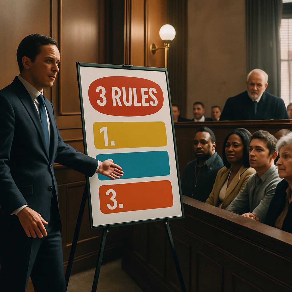
After more than thirty years of building litigation graphics for some of the most sophisticated trial teams in the country, I’ve noticed a pattern: the teams who win consistently follow the same three core rules, whether consciously or not. Conversely, the teams who struggle with persuading lay decision-makers tend to violate these rules — sometimes subtly, sometimes flagrantly.
These rules are not aesthetic preferences. They are grounded in cognitive psychology, attention span research, and the simple reality that most jurors don’t think the way lawyers do.
Here are the three rules:
-
Every litigation graphic should be understandable without explanation, and each should convey only one short sentence of meaning.
-
Never — not once — read the long-form text on a litigation graphic.
-
Do. There is no try. Eliminate bullet points entirely.
Let’s walk through why these rules matter, how to apply them, and how ignoring them undermines even the strongest case themes.
Rule #1: Every Litigation Graphic Should Be Understandable Without Additional Explanation — and Communicate One Sentence of Meaning
If a juror needs you to explain your graphic in order to understand it, the graphic has already failed. The point of a visual is to do cognitive work for the audience — not to give counsel something to talk about.
A litigation graphic must answer the question:
If the juror had no audio, would they still get the point?
Most lawyers create graphics the way they write briefs — layered, dense, multi-part, logical, and precise. But trial is not a reading exercise. The human brain can process speech or complex visuals — but not both at the same time. When you explain a visual, jurors stop listening. When you talk while they try to decode the visual, they stop understanding.
A persuasive trial graphic should:
-
Deliver a single clear message
-
Require almost no deciphering
-
Stand on its own, without narration
Think of it this way: Every litigation graphic should be the visual equivalent of one short declarative sentence:
-
“The product failed because the valve stuck.”
-
“We warned them — repeatedly — and they ignored us.”
-
“This witness changed her story three times.”
If the graphic contains more than one idea, you don’t need a better graphic — you need more slides.
Why This Matters:
Trial is not school. Jurors are not asked to learn every fact. They are asked to choose a story they believe. Stories are built from simple units of meaning — not pages of detail.
When every slide communicates one idea, you:
-
Control pacing
-
Maintain juror attention
-
Build narrative momentum
-
Prevent cognitive overload
Most importantly, you avoid the What is the point of this? problem — which is where persuasion dies.
Rule #2: Never, Not Once, Read the Long-Form Text on a Litigation Graphic
There is no faster way to lose juror engagement than reading text off a screen.
When you read text aloud that jurors can see, several psychological disruptions occur:
-
You signal that the audience is passive.
They stop thinking and start waiting for direction. -
You collapse your own authority.
Leaders don’t read slides. Presenters read slides. Jurors know the difference instinctively. -
You shift the juror’s working memory into conflict.
The dual-channel processing rule says:
The brain can read OR listen — but not both effectively, not at the same time.
The moment you start reading, jurors’ minds try to reconcile the visual and auditory streams. Cognitive load spikes. Comprehension drops. Attention drifts.
But Here’s the Subtle and Crucial Point:
I am not saying a slide can’t contain detailed or technical content. Many must — especially in patent, antitrust, financial fraud, complex commercial disputes, or regulatory matters.
I am saying:
If text appears on the slide, you should be expanding, interpreting, or reframing it — not reciting it.
Example:
Wrong way (common):
Counsel reads the mechanism-of-failure slide word for word.
Jurors sigh internally.
Right way:
Counsel says:
“The key point here is that the valve was already sticking long before the failure — and management knew it.”
The text is evidence.
Your voice provides the meaning.
This is the difference between presenting information and persuading.
You are not a narrator.
You are the interpreter of meaning.
Jurors follow interpreters — not readers.
Rule #3: Do. There Is No Try. Eliminate Bullet Points Entirely.
Bullet points are a shortcut for not making a decision.
They represent:
-
Indecision
-
Weak narrative control
-
Lack of prioritization
-
A belief that “more information is always better”
In reality, bullet points are the visual equivalent of a document dump. They create the illusion of thoroughness, while actually doing the opposite: they make every point weaker.
Bullet points require the juror to:
-
Read
-
Interpret
-
Rank importance
-
Decide what matters
But persuasion requires that you make those decisions for them.
Bullet points turn advocacy into information transfer.
If you want to persuade, you must choose:
-
The most important idea
-
The second most important idea
-
The narrative relationship between them
-
The emotional meaning of that relationship
Then you build one slide per idea — not one slide that lists them.
A Simple Test:
If you have a slide with seven bullet points, you don’t have one slide —
you have seven slides you haven’t made yet.
This is not about aesthetics.
It is about cognitive sequencing, which is the foundation of narrative persuasion.
The graphics must match the order in which you want jurors to think.
Slides are not notes for you.
Slides are cognitive scaffolding for them.
When These Rules Are Followed, Several Good Things Happen
-
Jurors stay with you.
They lean in. They react. They connect dots. -
Experts become more credible.
Experts who teach simply are remembered as trustworthy.
Experts who overwhelm are remembered as defensive. -
Damages presentations become dramatically more powerful.
Numbers only persuade when they are visualized and made intuitive. -
Opposing counsel appears disorganized, even when they are not.
If your story is clearer, simpler, and more visual — you win the framing war. -
Judges write your argument for you in their rulings.
Judges quote that which is simple, visual, and structurally coherent.
You are not just making slides.
You are shaping how jurors think about your case.
When These Rules Are Ignored, The Consequences Are Predictable
-
Jurors look confused.
-
The narrative feels slow.
-
Your strongest facts feel “complicated.”
-
Opposing counsel appears sharper simply by being simpler.
-
The jury instructions become the only thing jurors trust.
And ultimately:
-
Your version of the story stops being the story.
If you do not control meaning, the jury will manufacture its own.
How to Apply These Rules Immediately (Even If Your Trial is Soon)
-
Rewrite each slide as one sentence.
If the slide has more than one sentence of meaning, split it. -
Stand and deliver every slide without reading once.
If you can’t, the slide is too dense — simplify. -
Convert every bullet point into a visual relationship.
-
Sequence → Timeline
-
Contrast → A vs. B
-
Causation → Flowchart
-
Scale → Bar or ratio visual
-
Behavior change → Before vs. After
-
-
Ask: “Would a juror understand this in five seconds?”
If not — redesign.
These are not creative choices.
They are persuasion strategies.
Final Thought
The difference between a persuasive trial and a forgettable one is never technical sophistication. It is clarity. It is simplicity with purpose. It is telling a story that feels inevitable.
You win when your visuals do the work for you.
Because in a courtroom, jurors don’t remember the lawyer who said the smartest thing.
They remember the lawyer who made everything make sense.
Related Persuadius Articles
- Litigation Graphics: A Game-Changer in the Courtroom
- The 12 Worst PowerPoint Mistakes Litigators Make
- Lawyer Delivers Excellent PowerPoint Presentation
- 7 Ways to Avoid Making Your PowerPoint Slides Your Handout
- 12 Ways to Eliminate "But I Need Everything On That PowerPoint Slide"
- 16 PowerPoint Litigation Graphics You Won't Believe Are PowerPoint
- The Redundancy Effect, PowerPoint and Legal Graphics
- The Effective Use of PowerPoint Presentation During Opening Statement
- Don't Use PowerPoint as a Crutch in Trial or Anywhere
- How Much Text on a PowerPoint Slide is Too Much?
- Do Professionally Designed PowerPoint Slides Get Better Results?
- Why Reading Your Litigation PowerPoint Slides Hurts Jurors


Leave a Comment