

PowerPoint does funny things to people. For some, it is an amazingly accessible creative space to deliver important messages powerfully and persuasively (see Wait, Why is Powerpoint Cool Now). For others, it is a place to advertise how little they know about persuasion science.
Think of this article as a fun challenge reminiscent of the games found on cereal boxes from your childhood. Your task: spot the persuasion-killing mistakes on the slide above, then compare them to the ones I've highlighted below. I've already embedded numerous persuasion pitfalls in the text, making it easier for you to identify them. Let's see how many you can uncover and elevate your persuasion game.
Hopefully, this slide doesn't resemble your Trial Graphics/Litigation Graphics. If it does, you should contact me or press the request conflicts check button in the corner. In any case, I hope this article helps you and helps elevate the art of persuasion.

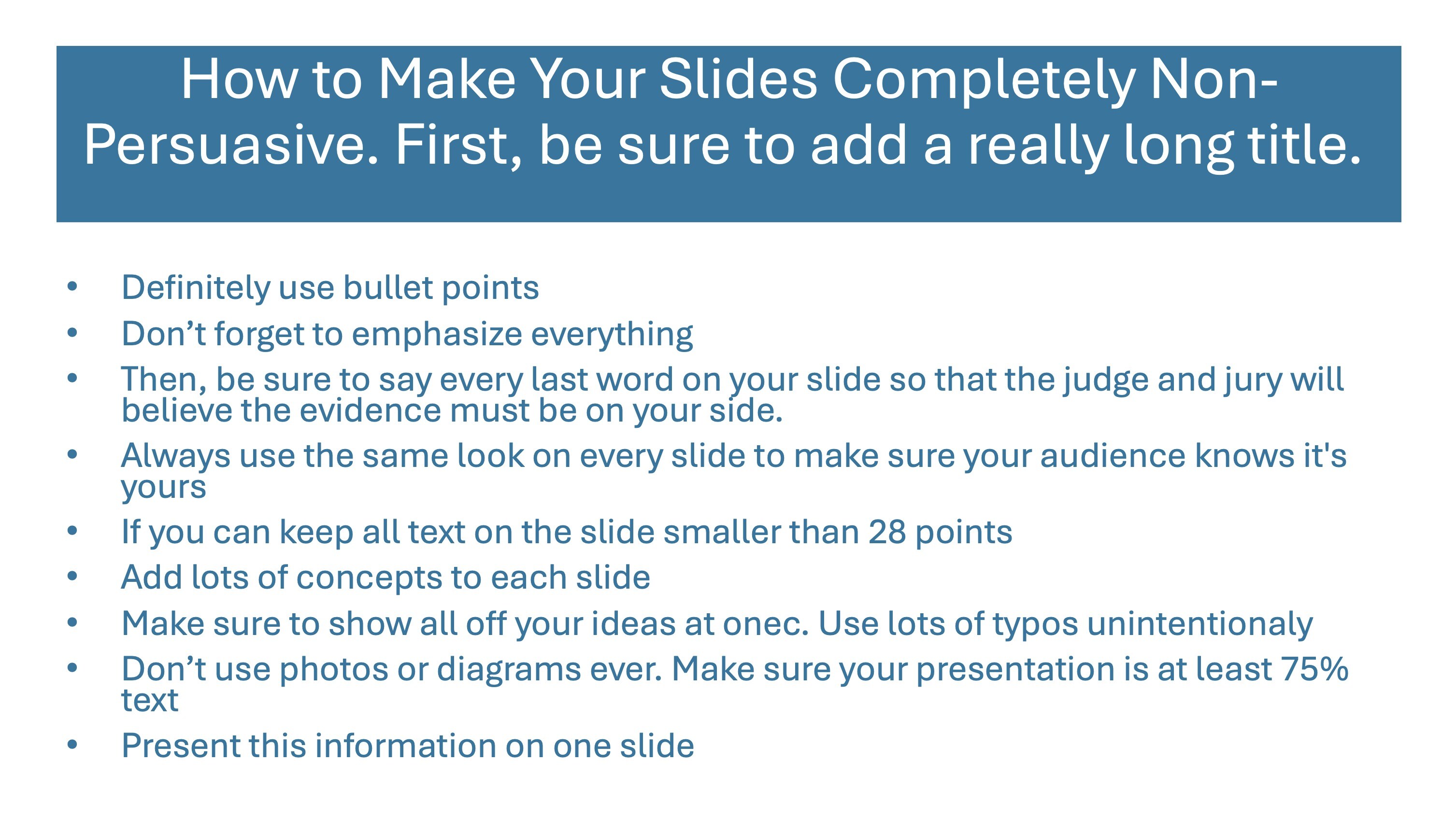
Here is the list of intentional persuasion errors I designed into this awful slide. How many can you spot?
- The template: The template looks cheap, and looking cheap kills persuasion. Slides that look well-designed are scientifically proven to be more persuasive. See Why Expensive-Looking Litigation Graphics Are Better.
- The title bar position: Science shows that if your templates have a title bar consistently positioned in the same place, it will be ignored. See Could Surprise Be One of Your Best Visual Persuasion Tools?
- The title length: Have you ever seen a trial team add incredibly long titles to their slides? I certainly have, and it doesn't work. The judge or jury is just not going to read along with you. And you shouldn't be reading the contents of your slide anyway. See item 6.
- The color of the title bar: Projectors and TV screens may not display colors accurately compared to what you see on your computer screen. To ensure visibility and accessibility, opt for high-contrast colors and always consider the possibility of a colorblind individual in your audience.
- The line-breaking hyphen: Did you catch the part where "non-persuasive" is divided into two lines in the title? Let's avoid that, as it can be challenging to follow along.
- Bullet points: Never use bullet points—not once, not ever, and for that matter, don't use anything like them, either. See Powerful PowerPoint Presentation Tips: Ditch the Bullet Points!
- Emphasize everything: The designer of a slide like this may believe every detail is crucial. While all elements hold significance, certain aspects, such as key defense or claim components, should be highlighted for emphasis.
- Reading your slides: It's uncertain if the designer of this slide would actually read it, but it's a safe assumption that they might. If you read your slide content to a judge or jury, it's best to skip showing it altogether. This practice is detrimental to persuasion and should be avoided at all costs. Humans cannot process written words and listen to them being read simultaneously. There's also a tendency to compete for who can read faster. See Why Reading Your Litigation PowerPoint Slides Hurts Jurors.
- Branding: Would you rather use a consistent color scheme that matches your client's brand colors, or would you rather keep your audience engaged? Hopefully, your answer is the latter. Keep surprising your audience with different elements, fonts, and looks all together. See Why Expensive-Looking Litigation Graphics Are Better
- Font size: Keep all text on the slide LARGER than 28 points. Yes, even in the callouts.
- One concept, one slide: I would rather you show 300 slides with one concept instead of 50 with six concepts.
- Only use typos intentionally: Carefully check each slide for typos and only use them if you are trying to get attention; they can be an excellent way to wake up a judge or jury. We will use a typo in the subject line of a marketing email, and sure enough, that gets it opened at almost double the rate of a correct subject line.
- Mix your media. I often emphasize the importance of blending different media types to convey your message effectively. I also stress the significance of leveraging surprise to your benefit in the courtroom. The key takeaway is that incorporating variety, visual or otherwise, captures attention, which is essential for persuasion. Make it a habit to frequently switch up your presentation techniques to keep your audience engaged and receptive. See 5 Ways to Apply Active Teaching Methods for Better Persuasion.
- Too much text: The answer is yes if you ask whether this is too much text. The best slides have perhaps a dozen words on them. Think Apple-style presentation. Of course, that doesn't make sense when quoting contract language or another document. See How Much Text on a PowerPoint Slide is Too Much?
- Utilize visuals to streamline intricate concepts: Visual aids simplify intricate or technical information for a general audience. Incorporate charts, graphs, diagrams, and other visuals to visually represent complex ideas and enhance comprehension. If conducting a mock trial is not on your agenda, consider testing the effectiveness of these visuals with your family and colleagues to ensure they effectively convey the intended message. See 5 Rules for How Simple a Trial Presentation Should Be
- Use separate notes: If you read your slides, you will probably use them as a crutch. Instead, create a separate notebook of your slides with what you want to say under the slides. You'll deliver a much more engaging presentation. See Don't Use PowerPoint as a Crutch in Trial or Anywhere and 12 Ways to SUCCESSFULLY Combine Oral and Visual Presentations.
- Widow words: Glance over the bullet points and notice the words "yours" and "text" standing alone on a single line. These lone words, often referred to as widow words by typesetters, may not directly sabotage persuasion, but they certainly come off as distracting and indicative of inadequate preparation.
Well, how many persuasion errors did you find? Did you find any that I missed? Need help with your presentation? Drop me a line.


Leave a Comment