

The other day, I did a simple experiment in a room full of lawyers from the Los Angeles Bar Association.
Roughly 200 people.
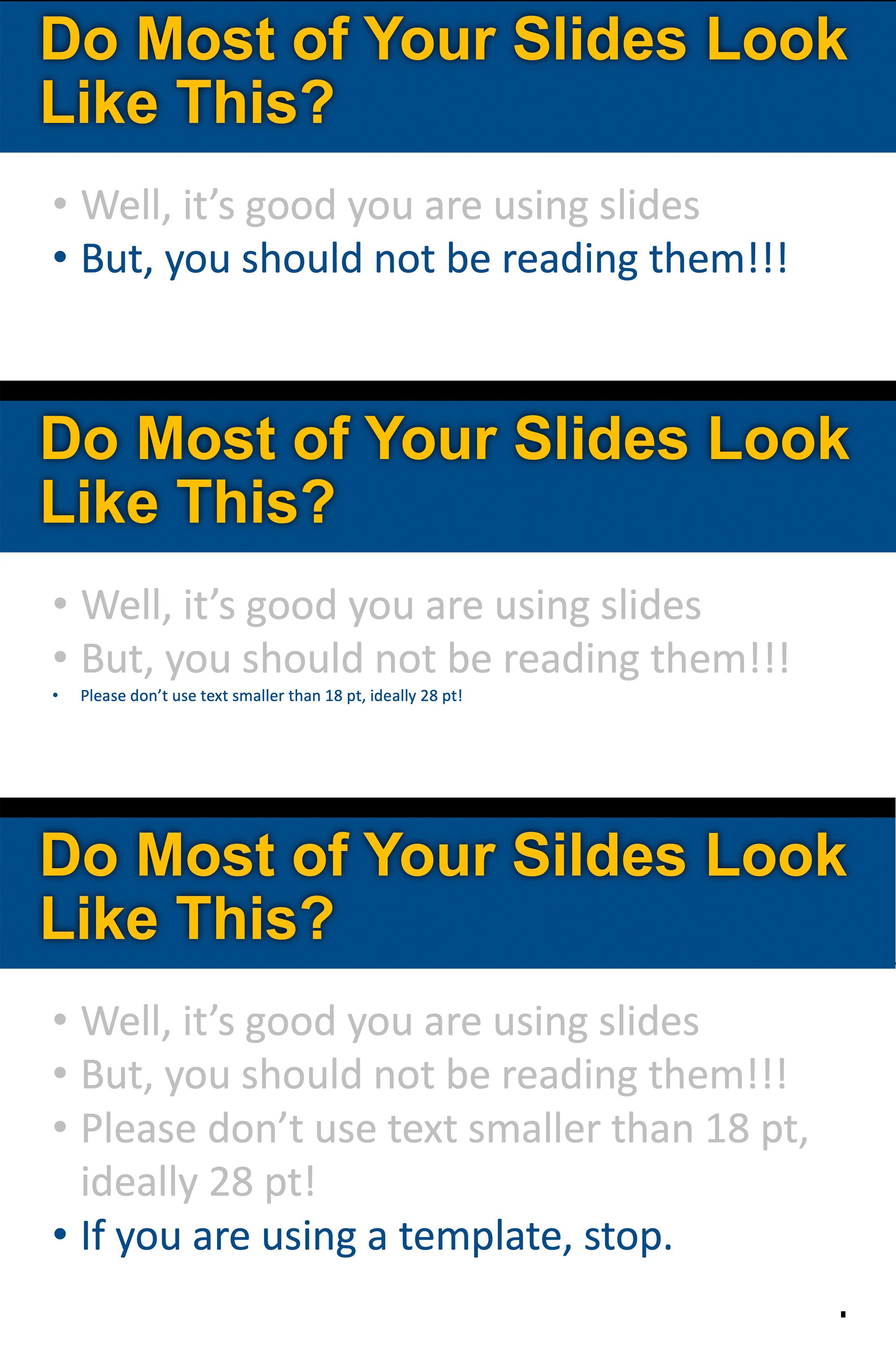
I showed a few slides in a row. Same layout. Same structure. Same visual rhythm. Same title.
Then I showed a fourth slide.
Same design.
Except for one thing:
There was a typo on it.
A pretty obvious one.
Then I asked the room:
“How many of you noticed the typo?”
About five hands went up.
Five… out of two hundred.
The uncomfortable truth
It wasn’t that the audience wasn’t smart.
It wasn’t that they weren’t paying attention.
It’s that their brains had already decided what my slides were going to say—and stopped really looking or reading.
That’s not a presentation problem.
That’s a human cognition problem.
The science behind what just happened
There’s a large body of research—most notably from psychologist Richard Mayer’s work on multimedia learning—that explains this.
Here’s the simplified version:
- People process information through a limited mental bandwidth
- When stimuli are repeated, the brain automates and compresses processing
- Attention drops as the brain says:
“I’ve seen this already. I know what this is.”
This is called habituation.
And once it kicks in, you’re not persuading anymore.
You’re just… talking over a slideshow.
Why uniform slides are dangerous
Most PowerPoint decks follow a rigid template:
- Title at the top
- Bullet points below
- Same font, same structure, every slide
It feels clean. Professional. Safe.
But cognitively?
It creates a continuous stream of sameness.
And when everything looks the same, the brain stops distinguishing what matters.
Even obvious things.
Like a typo—or your key messages
What the research says
No, there isn’t a study that says:
“Moving your title bar increases persuasion.”
But there is overwhelming research supporting these principles:
1. Signaling matters
People pay more attention when visual cues signal importance.
Change the layout, and the brain asks:
“Wait—what’s different here?”
2. Segmentation improves processing
When information is broken into distinct visual chunks, people understand and remember more.
Uniform slides blur those boundaries.
3. Cognitive load is real
Too much repetition—or too much clutter—both reduce comprehension.
The goal isn’t chaos.
It’s intentional variation.
What I should have done (and what you should do)
If I wanted more than 5 out of 200 people to catch that typo (or the point you are trying to make), I should have:
- Changed the layout of the fourth slide
- Moved the title
- Altered the visual hierarchy
- Introduced a new structure
Not randomly—but deliberately.
Because variation does one critical thing:
It forces the brain to re-engage. See Could Surprise Be One of Your Best Visual Persuasion Tools?
The persuasion takeaway
In the courtroom, this matters more than anywhere else.
Jurors aren’t evaluating your slides the way you are.
They’re:
- Filtering
- Skimming
- Predicting
- Tuning out
And if your visuals don’t interrupt that pattern, your most important points can pass by unnoticed.
Just like my typo.
The real goal isn’t design—it’s attention.
You’re not designing slides.
You’re designing moments of attention.
And attention is the gateway to:
- Understanding
- Memory
- And ultimately… persuasion
Try this in your next presentation.
Run your own version of the experiment:
- Show three visually similar slides—yes, you change the titles
- Follow with a fourth that blends in, but change a few things
- Ask your audience what they noticed, or ask your audience what the titles of your first and second slides were.
You may not like the answer.
But you’ll never design slides the same way again.
CTA
If you’d like help building a presentation that actually holds attention—whether it’s for trial, arbitration, or a high-stakes internal pitch—we’re happy to help.
- Book a free 15-minute case consultation (we’ll look at your deck together and give immediate feedback)
- Or email us confidentially at confidential@persuadius.com


Leave a Comment